
Postcard Mockups
Here is something I wish someone had told me earlier. A postcard is not paper. It is a promise. A promise that someone took time to choose, write, and send something physical. When I present postcard designs to clients, I am not selling them a rectangle with a picture on it. I am selling them a moment. A feeling of receiving something beautiful in a world full of emails and notifications. That is why Postcard Mockups are non negotiable in my workflow. They transform a flat design into a tangible object that exists in someone’s hands. In this article, I will show you the exact scenes I use to make clients feel the weight, texture, and emotion of physical print design.
Minimalist Flat Lay with Blank Paper and Branch
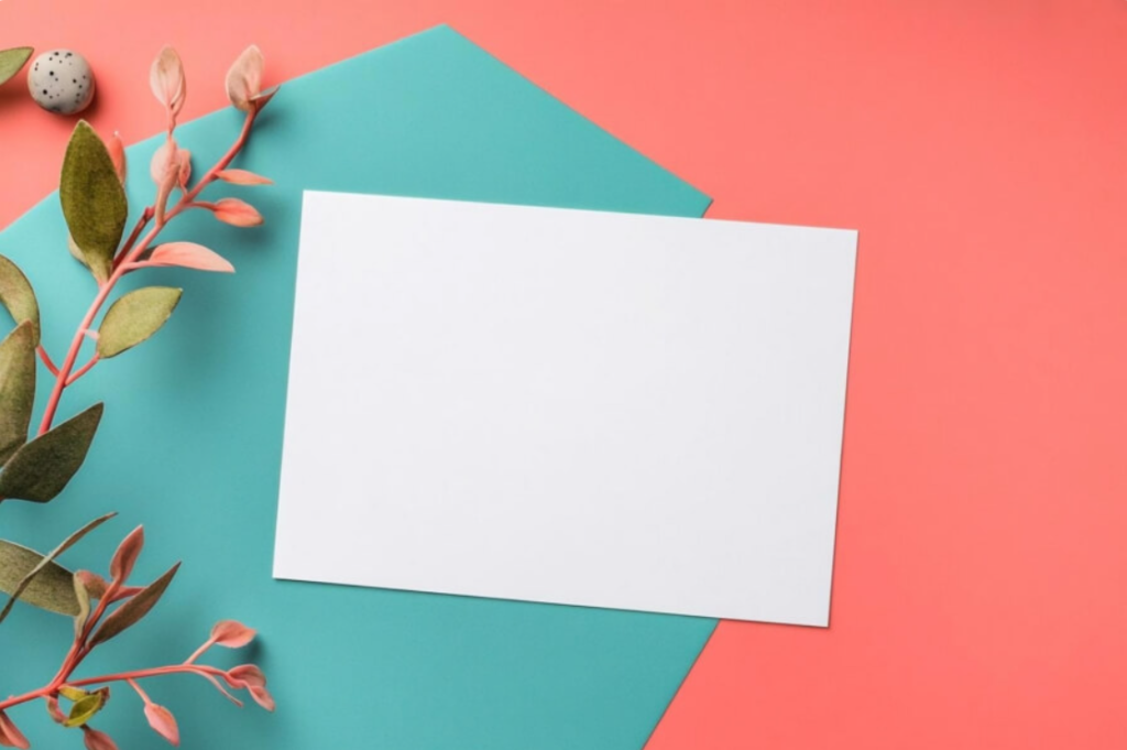
Here is a trick I learned from packaging designers. Texture sells faster than color. This turquoise background with a pinkish branch and a speckled stone creates a surface that looks interesting without competing with your design. I use this mockup when I want clients to imagine their postcard on a styled shelf or a design blog. The branch adds organic movement. The stone adds grounding. The blank paper invites possibility. My advice. Use flat lays when you want to sell lifestyle, not just the object itself.
Check out this Postcard Mockup now.
Minimalist Leaf Composition on Red Background
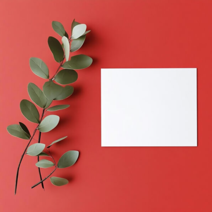
Red is dangerous. Use it when you mean it. This composition with a green leaf branch against a vibrant red background and a white square in the center is a masterclass in contrast. I used this for a holiday card client who wanted to feel bold but not aggressive. The green leaf softened the red. The white card gave the eye a resting place. Here is the rule. When you use high saturation backgrounds, always include a neutral element to balance it. White card. Green leaf. Either works. Never let the background swallow your design.
Check out this Postcard Mockup now.
Hand Holding Empty White Sheet in Forest

Hands are risky in mockups. A poorly placed hand looks awkward. A well placed hand looks like a memory. This forest scene with a hand holding a blank sheet is the second type. The lush green trees and flowers create serenity. The hand feels gentle, almost reverent. I use this mockup for brands that sell peace, nature, or mindfulness. A yoga studio. An eco resort. A wellness journal. The forest says “this postcard came from somewhere calm.” The hand says “someone cared enough to hold it.”
Check out this Postcard Mockup now.
Minimalist Floral Arrangement on Marble
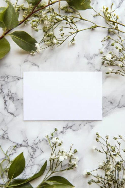
Marble surfaces are not neutral. They are statements. They say luxury, permanence, and taste. This mockup with delicate white flowers, green leaves, and a blank white card on polished marble is one of my favorites for high end clients. I used it for a wedding invitation suite presentation. The marble added sophistication without a single word. My advice. Use marble mockups for premium brands, luxury events, and any client who wants to feel expensive. Never use them for budget projects. Marble cannot be cheapened.
Check out this Postcard Mockup now.
Blank White Card on Wooden Surface with Green Leaves
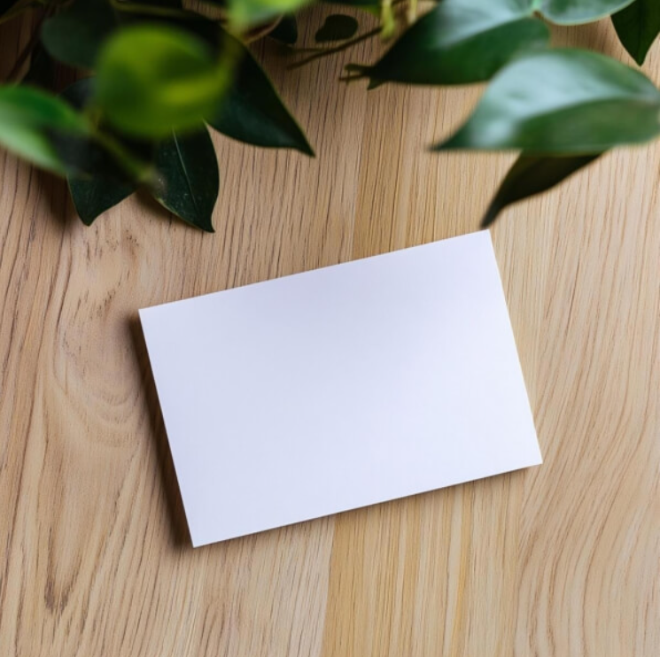
Wood and white. That combination has saved me more times than I can count. This mockup with a blank card on smooth wood surrounded by green leaves is the ultimate middle ground. Not too cold. Not too warm. Just right. I reach for this when I do not know the client’s taste yet. It is safe enough to avoid rejection but stylish enough to feel professional. Think of this as your reliable friend. Always available. Never lets you down.
Check out this Postcard Mockup now.
Coffee and Blank Card with Greenery
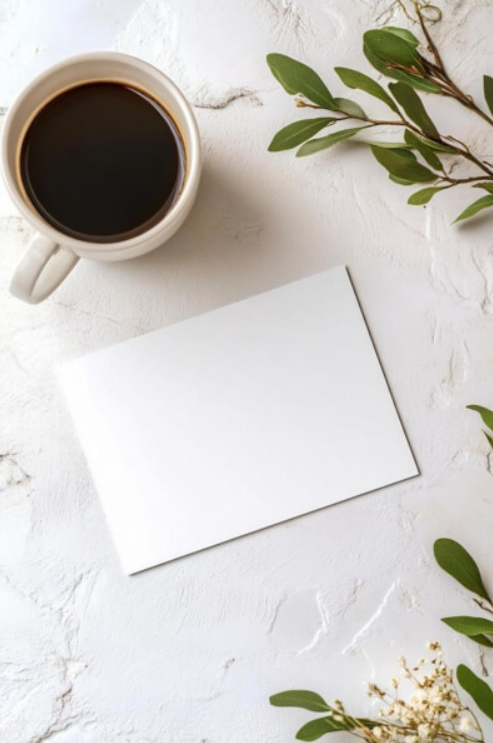
Coffee and design go together like clients and revisions. This mockup with a white mug of dark coffee next to a blank card, surrounded by green leaves and white flowers, feels like a Saturday morning. I used this for a creative agency pitch. The client said it “felt like working in a Copenhagen cafe.” That is the power of props. A coffee mug is never just a coffee mug. It says “this is where ideas happen.” Use this mockup when you want your design to feel part of a creative ritual, not a corporate transaction.
Check out this Postcard Mockup now.
Minimalist Card with Eucalyptus and Flowers
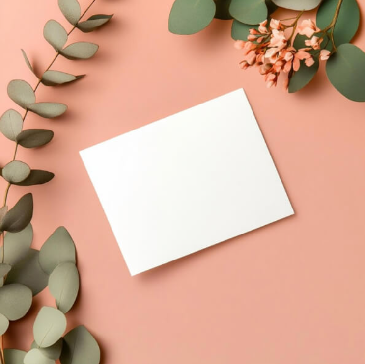
Eucalyptus is having a moment. And for good reason. Its muted green tones and soft silhouette add elegance without shouting. This mockup with a blank white card on a soft peach background, surrounded by eucalyptus and delicate pink flowers, is perfect for feminine brands, beauty clients, and invitation designers. I used this for a bridal shower invitation. The client cried when she saw it. That is the level of emotional response you can achieve with the right setting.
Check out this Postcard Mockup now.
White Paper and Brown Envelope with Dried Wheat
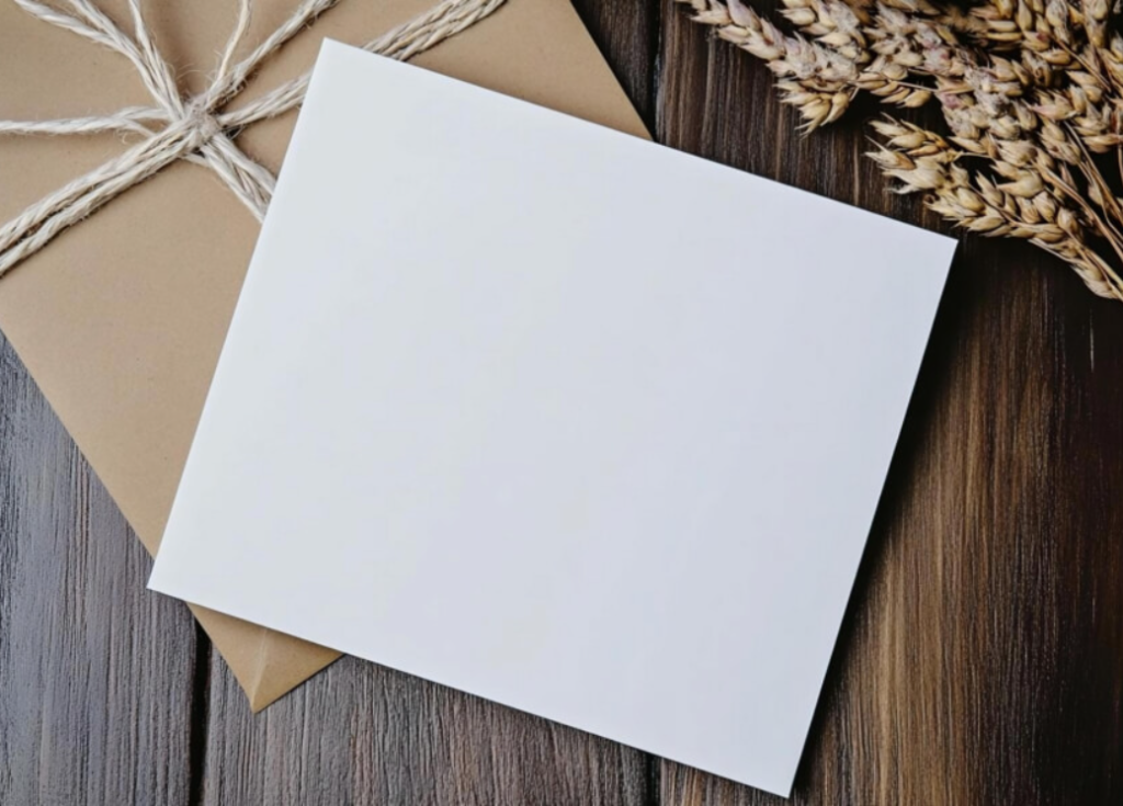
Rustic is not a trend. It is a feeling. This mockup with a blank white sheet on a brown envelope tied with twine, resting on wood with dried wheat stalks, transports the viewer to a farmhouse or a countryside cottage. I used this for a harvest festival brand and a sustainable farm website. The dried wheat whispered “natural, handmade, honest.” My advice. Use rustic mockups for brands that value authenticity over polish. Organic food. Artisanal goods. Heritage products. The twine and wheat do the storytelling for you.
Check out this Postcard Mockup now.
Blank White Paper on Yellow Background

Yellow is joy. This mockup with a blank white sheet angled on a vibrant yellow background is pure optimism. I used this for a children’s book presentation and a summer camp brochure. The yellow said “fun” before the client even saw the design. Here is the technique. Use yellow backgrounds when you want to sell happiness. Use them for anything targeting families, kids, or leisure. But never use yellow for serious, formal, or luxury brands. Joy and gravity do not mix well.
Check out this Postcard Mockup now.
Festive Gift and Card Arrangement
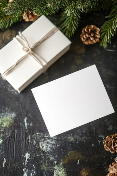
Holiday campaigns are high stakes. Deadlines are tight. Budgets are stretched. That is why I love this mockup with a wrapped white gift box, twine, a blank card, pine tree branches, and pine cones on a dark tabletop. It does the seasonal work for you. I used this for three different holiday campaigns last year. Same mockup, different card designs. The client never noticed. Why? Because the scene sells Christmas better than any copywriter could. Use this for December launches. It is the closest thing to a guaranteed approval.
Check out this Postcard Mockup now.
Nature Inspired Layout with Leaves and Flowers
Serenity has a visual language. This arrangement of green leaves and delicate white flowers surrounding a blank card on a light surface is that language. The leaves are various shades of green. The flowers are small and clustered. The overall effect is calming and inviting. I used this for a spa brand and a meditation app landing page. The client said it “felt like a deep breath.” That is not a design compliment. That is a sale. Use this for brands that sell peace.
Check out this Postcard Mockup now.
Minimalistic Card with Eucalyptus Leaves
Split backgrounds are bold. This mockup with a blank card placed diagonally across soft pink and muted green backgrounds, with eucalyptus leaves to the side, is visually arresting. The diagonal placement adds movement. The color split adds depth. I used this for a fashion brand lookbook. The client loved that the mockup itself felt editorial. My advice. Use split backgrounds when your design needs a modern, fashion forward context. Use solid backgrounds for classic or traditional brands. The background structure matters as much as the colors.
Check out this Postcard Mockup now.
Blank Card Surrounded by Greenery and Flowers
Soft pink backgrounds are having a long moment. This mockup with a blank white card against a soft pink background, surrounded by delicate greenery and light pink flowers, is feminine without being fragile. I used this for a stationary brand presentation. The client specifically requested “something that feels like a garden party.” This delivered. Here is the lesson. Listen to your client’s adjectives. If they say “garden party,” show them garden parties. If they say “corporate,” show them corporate. Do not impose your aesthetic on their brand.
Check out this Postcard Mockup now.
Blank Card on Colorful Background with Leaves
Yellow and green together is underused. This mockup with a blank white card on a split background of yellow and green surfaces, with a leafy branch on the right, creates a fresh, vibrant energy. I used this for an organic food brand and a farmer’s market website. The yellow and green said “natural and cheerful” without needing a single word of copy. My advice. When choosing split backgrounds, ensure the two colors share an emotional tone. Yellow and green both feel natural and optimistic. Yellow and gray? That is a different story entirely.
Check out this Postcard Mockup now.
Lavender and Greenery with Blank Card
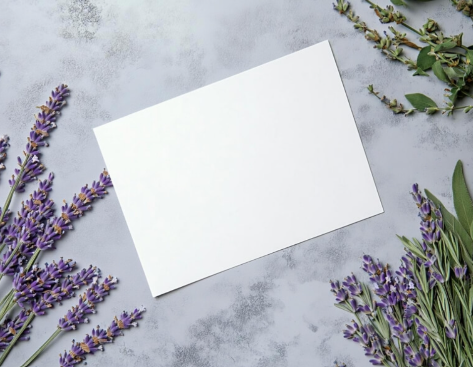
Lavender is the most underrated color in design mockups. This image with deep purple lavender stems and fresh greenery surrounding a blank white card on a subtle gray background is calming, elegant, and slightly nostalgic. I used this for a senior living brand and a memorial service card. The lavender added a dignity that no other color could achieve. Here is the rule. Lavender says “gentle, respectful, peaceful.” Use it for brands that need to communicate care, not energy. It is a specific tool for a specific job.
Check out this Postcard Mockup now.
Here is the thing about Postcard Mockups that most designers miss. They are not about the card. They are about what happens to the card. Does someone open it on a marble counter? Does someone hold it in a forest? Does it arrive next to a gift box with pine cones? These details are not decorations. They are proof. Proof that your design will live somewhere beautiful. Proof that your client’s brand will feel real, not virtual. Proof that someone, somewhere, will hold this object and feel something. So stop presenting postcards as flat rectangles on white backgrounds. Start placing them into worlds. And watch your clients stop asking “what is this?” and start asking “when can we print this?”