
Flyer Mockups
I have a confession to make. I used to hate designing flyers. Not because I could not make them look good, but because I could never get clients to understand them. A flyer on a flat screen looks like a document. A flyer in a real setting looks like an event. The difference is everything. That is when I discovered that Flyer Mockups are not about showing the paper. They are about showing the moment when someone picks it up, reads it, and decides to show up. A flyer is not a digital file. It is a handshake between a brand and a stranger. In this article, I will walk you through the scenes I use to make clients feel the weight, texture, and intention of their flyer designs before they ever print a single copy.
Check out this Flyer Mockup now.
Cozy Coffee Scene with Greenery on Wooden Table
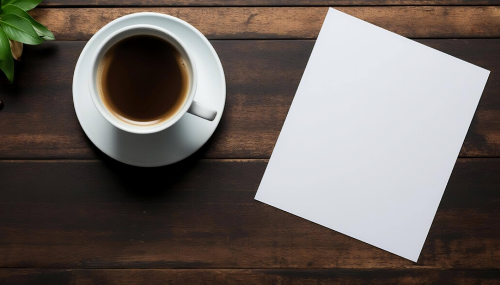
Coffee shops are the natural habitat of flyers. This image with a cup of coffee, an empty sheet of paper, and greenery on a wooden table captures exactly that. The rustic feel suggests a local cafe, a creative space, or a community board. I used this mockup for a local music event flyer. The client said it “looked like it belonged in the cafe down the street.” That is the power of context. A flyer in a coffee shop says “this is for real people in real places.” Use this when your flyer is for local events, community gatherings, or anything that lives in physical spaces.
Check out this Flyer Mockup now.
Pink Notebook Surrounded by Pink Flowers on Pink Background
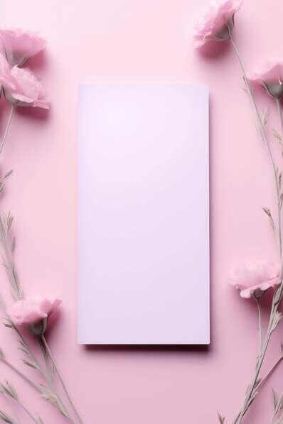
Monochrome magic. This image of a pink notebook amidst pink flowers on a pink background is a masterclass in tonal harmony. The blank page offers versatility. The flowers add softness. I used this mockup for a beauty brand flyer and a wellness retreat invitation. The pink on pink on pink created a cohesive, feminine aesthetic that felt intentional, not accidental. My advice. When your flyer design is bold or busy, use a monochrome mockup to create balance. The visual rest helps the viewer focus on the content, not the chaos around it.
Check out this Flyer Mockup now.
White Notebook on Pink Background with Tulips
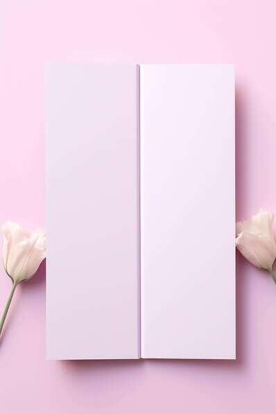
Pink tulips are a signal. They say “spring, freshness, elegance.” This image of a white notebook on a pink background with two pink tulips in the foreground is simple, clean, and aspirational. I use this mockup for event invitations, wedding flyers, and any project targeting a feminine audience. Here is the rule. Flowers are not decoration. They are emotional cues. Tulips say elegance. Roses say romance. Sunflowers say warmth. Choose your flowers like you choose your fonts. With intention.
Check out this Flyer Mockup now.
Blank White Sheet of Paper Against Gray Background

Simplicity is a power move. This image of a blank white sheet leaning against a gray wall with a subtle shadow is minimalism at its best. The slight bend in the paper adds texture. The gray wall keeps the focus clean. I use this mockup when I need to present a flyer design without any competition. No plants. No coffee. No flowers. Just the design and the space around it. My advice. Use this mockup for client approvals, proofing sessions, and any conversation where the design itself needs to be the only topic. Everything else is just noise.
Check out this Flyer Mockup now.
Pink Background with White Boards and Palm Leaf
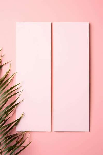
Palm leaves are having a cultural moment. This image with a pink background, two blank white boards, and a palm leaf is versatile, fresh, and modern. I used this mockup for a summer event flyer and a tropical brand launch. The palm leaf signaled “vacation, warmth, escape.” Here is the lesson. A single prop can change the entire emotional register of a flyer. A palm leaf says summer. A pine branch says winter. A coffee cup says morning. Choose your props based on the season and the feeling you want to evoke.
Check out this Flyer Mockup now.
Blank White Paper Sheet on Wall
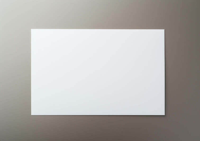
A flyer on a wall is a flyer in its natural environment. This image of a blank white sheet hanging on a wall suggests a gallery, a community board, or a studio space. I use this mockup when I want to show how a flyer looks in a public setting. The wall adds scale. The hanging suggests “this is meant to be seen.” Here is the rule. When your flyer is for public events, use wall mockups. When your flyer is for direct mail, use tabletop mockups. The setting tells the story of how the flyer will be encountered.
Check out this Flyer Mockup now.
Empty Green Notebook and Candles on Pink Wooden Table
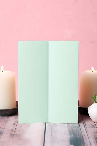
Candles are emotional. This image of an empty green notebook, candles, and flowers on a pink wooden table with a pastel background is warm, inviting, and slightly nostalgic. I used this mockup for a wellness workshop flyer and a retreat invitation. The candles signaled “relaxation, reflection, care.” My advice. Use candle mockups for brands that sell peace, rest, or self care. Candles suggest slowing down. If your flyer is for a high energy event, skip the candles. The mood will not match.
Check out this Flyer Mockup now.
Minimalist White Paper Frame on Pink Background
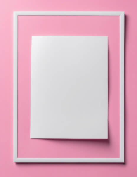
Framing changes perception. This image of a white sheet framed against a pink background with a subtle white border creates a sense of importance. The framed paper looks like art, not just paper. I use this mockup for gallery invitations, art show flyers, and any project where the flyer itself needs to feel elevated. Here is the rule. Use framed mockups for premium presentations. Use unframed mockups for casual or mass market projects. The frame adds perceived value. Use it intentionally.
Check out this Flyer Mockup now.
Beauty and Fashion Concept with Pink Boxes and Candle
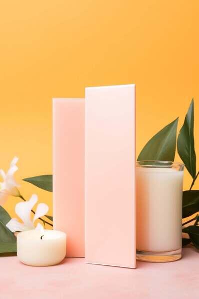
Pink boxes and candles suggest luxury retail. This image with three pink boxes, a candle, and green leaves on an orange background is built for beauty and fashion brands. I used this mockup for a makeup launch flyer and a fashion pop up invitation. The pink boxes signaled product. The candle signaled atmosphere. The orange background added warmth. My advice. When presenting flyers for retail brands, use retail styled mockups. The context tells the client that their flyer belongs in a store, not just on a screen.
Check out this Flyer Mockup now.
Blank White Sheet Against Purple Wall
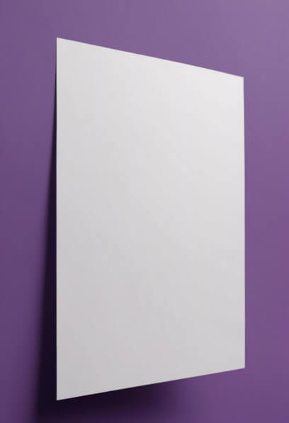
Purple is the color of creativity. This image of a blank white sheet against a vibrant purple wall with a slight askew placement is clean, minimalistic, and inspiring. The contrast between the stark white and the deep purple creates visual tension. I use this mockup for creative portfolios, art event flyers, and any project targeting creative professionals. Here is the rule. Purple says “imagination, originality, non conformity.” Use it when your flyer needs to feel artistic. Avoid it for corporate or conservative brands. The mismatch will be obvious.
Check out this Flyer Mockup now.
Blank White Card on Brown Surface with Leaves and Branches
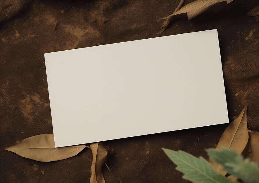
Rustic scenes sell authenticity. This image of a blank white card on a brown surface with leaves and branches scattered around is versatile and warm. The background can be adjusted to create rustic, vintage, modern, or abstract moods. I use this mockup for farm to table events, outdoor festivals, and any brand that values natural aesthetics. My advice. When your flyer promotes something organic, handmade, or natural, use rustic mockups. The leaves and branches do the branding for you. No words needed.
Check out this Flyer Mockup now.
Minimalistic Purple Frame
Sometimes all you need is a frame. This simple composition of a rectangular white frame against a purple background is minimalistic and modern. No props. No flowers. No coffee. Just color and form. I use this mockup for portfolio presentations, concept work, and any conversation where the design itself needs to be the absolute center of attention. Here is the lesson. A frame is not just a border. It is a signal of importance. Framed work feels finished. Unframed work feels in progress. Choose based on the stage of your presentation.
Check out this Flyer Mockup now.
Blank Pink Card and Floral Arrangement on Wooden Table
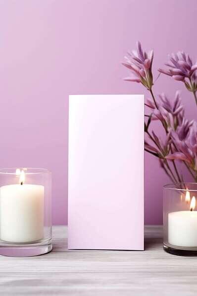
Pink and flowers together is a classic combination for a reason. This image of a blank pink card, candles, and flowers on a wooden table with a purple background is versatile and elegant. I used this mockup for a wedding invitation flyer and a bridal event promotion. The pink card matched the floral theme. The wooden table added warmth. My advice. When presenting flyers for celebratory events, use celebratory scenes. The mockup should feel like the event itself. A wedding flyer on a sterile white background feels wrong. A wedding flyer among flowers feels right.
Check out this Flyer Mockup now.
Three-Panel Exhibition Display in Pink, Purple, and Blue Hues
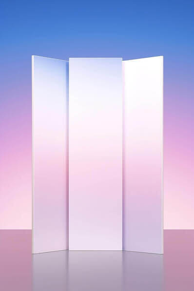
This is not a single flyer mockup. It is a whole presentation system. The three panel display with pink, purple, and blue hues and white panels creating the illusion of space is perfect for exhibition flyers, trade show materials, and gallery presentations. I use this mockup when I need to show how a flyer fits into a larger visual system. Here is the rule. Use single mockups for standalone flyers. Use multi panel mockups for campaigns and collections. Scale matters. Show your client the full picture, not just the piece.
Check out this Flyer Mockup now.
Minimalist White Rectangle on Yellow Background
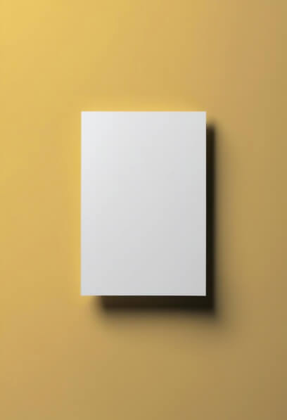
Yellow is the color of optimism. This image of a simple white rectangular object against a soft yellow background with a subtle shadow is calm, simple, and aesthetically pleasing. The minimalist design emphasizes the contrast between white and yellow. I use this mockup for summer events, creative workshops, and any flyer that needs to feel bright and approachable. My advice. Use yellow mockups when your flyer is about joy, creativity, or community. Use neutral mockups for serious or professional content. Yellow sets a specific emotional tone. Respect it.
Check out this Flyer Mockup now.
Minimalistic White Paper on Olive Green Background
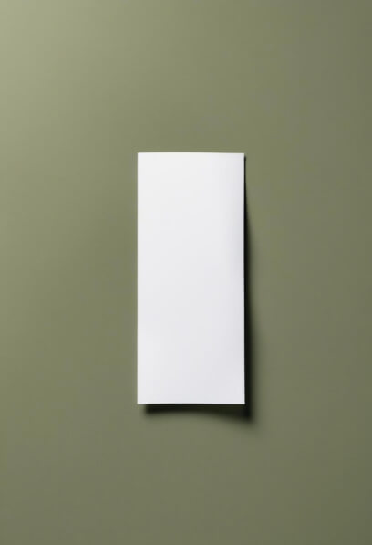
Olive green is sophisticated and underused. This image of a blank white sheet resting against a muted olive green background with a slight curve and gentle shadows is elegant, serene, and modern. I use this mockup for high end brands, eco conscious products, and any flyer that needs to feel calm and intentional. Here is the lesson. Olive green says “nature, stability, quiet confidence.” Use it when your flyer needs to feel grounded, not flashy. It is a subtle color that signals substance over style.
Check out this Flyer Mockup now.
Conclusion
Let me be direct. Flyer Mockups are not about the paper. They are about the moment when paper meets life. A flyer on a wooden table says “I belong in a cafe.” A flyer among flowers says “I belong at a celebration.” A flyer on a wall says “I deserve to be seen.” A flyer against a purple wall says “I am art.” Every flyer in this collection tells a different story. The question is not which mockup looks the best. The question is which mockup tells the right story for your client’s brand. A coffee shop flyer looks wrong in a wedding scene. A wedding flyer looks wrong on a grey wall. A fashion flyer looks wrong in a forest. Match the mockup to the message. And watch your clients stop asking “what is this?” and start asking “when can we print it?”