
T-Shirt Mockups
Think about the last time you bought a t-shirt online. You did not buy it because of the fabric composition or the stitching details. You bought it because you could see yourself wearing it. That is the magic of a great t-shirt presentation. It transfers ownership from the designer to the customer before anyone makes a purchase. When I present t-shirt designs to clients, I am not just showing them artwork on a flat surface. I am showing them a version of reality where their brand exists on a human body, in a specific season, under a specific light. That is what T-Shirt Mockups give me. The power to make clients believe their designs are already real. In this article, I will walk you through the scenes I use to create that belief, and why each one works for different brands and different conversations.
Check out this T-Shirt Mockup now.
Male Model in Black T-Shirt
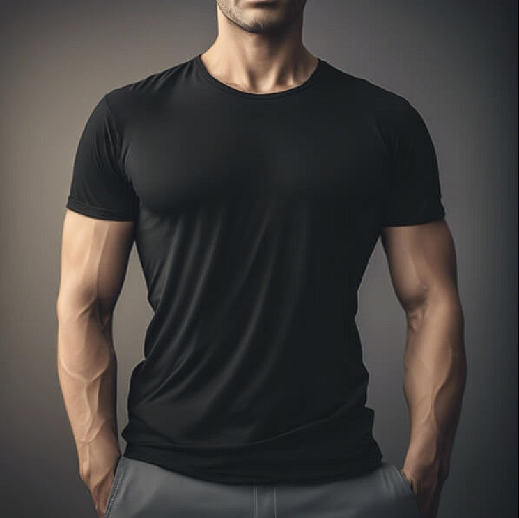
Here is a lesson I learned the hard way. Fit sells faster than fabric. This image of a male model in a black fitted t-shirt with gray shorts, standing confidently with well-defined muscles, is not about the model. It is about the silhouette. The dramatic background lighting highlights the contours of his physique. But more importantly, it shows how the shirt behaves on a real body. I use this mockup when I want clients to see the garment’s structure, not just the print. My advice. Use fitted model shots for activewear, streetwear, and any brand that values silhouette. A shirt that fits well looks expensive. A shirt that hangs limp looks cheap.
Check out this T-Shirt Mockup now.
Empty White T-Shirt Mockup on Wooden Wall
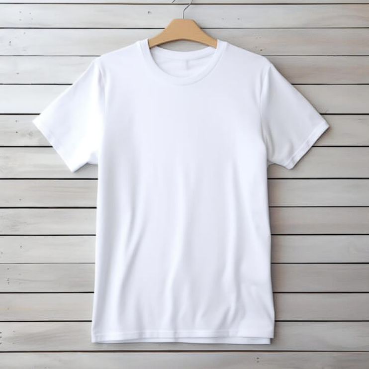
Minimalism is not a lack of effort. It is a choice. This empty white t-shirt hanging on a wooden wall is a choice to let the product speak without competition. I use this mockup for one specific scenario. Client approvals on color and texture. No model. No lifestyle. Just the garment, the fabric, and the wall. The wooden background adds warmth without distraction. Here is the trick. When a client is hung up on details, remove everything else. A blank shirt on a simple wall forces focus. Use this when you need decisions, not inspiration.
Check out this T-Shirt Mockup now.
Autumn Themed Display with T-Shirt and Pumpkins
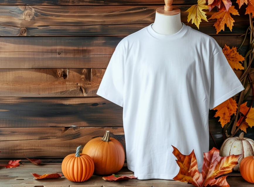
Seasonal marketing is a short window. Miss it and you wait a year. This mockup with a plain white t-shirt on a mannequin against a rustic wooden backdrop with autumn leaves and pumpkins is my go to for September through November. The warm tones of the wood and the vibrant fall foliage create a cozy, festive atmosphere. I used this for a Halloween collection presentation. The client approved it immediately because the scene answered the question “does this feel like October?” before I even spoke. My advice. When you present seasonal work, use seasonal mockups. The pumpkins do the heavy lifting.
Check out this T-Shirt Mockup now.
Minimalist Black T-Shirt Hanging
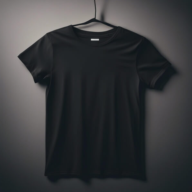
Black on gray is a test of courage. This image features a black t-shirt hanging on a black hanger against a muted gray background. The soft shadows enhance the fabric texture. The presentation is clean, elegant, and unforgiving. I use this mockup when I need to prove that a design works without color crutches. A design that looks good on this mockup looks good anywhere. Here is the rule. Use minimalist hanging shots for portfolio work and high end brands. Use lifestyle shots for mass market and social media. Know the difference between selling art and selling product.
Check out this T-Shirt Mockup now.
Man in White T-Shirt
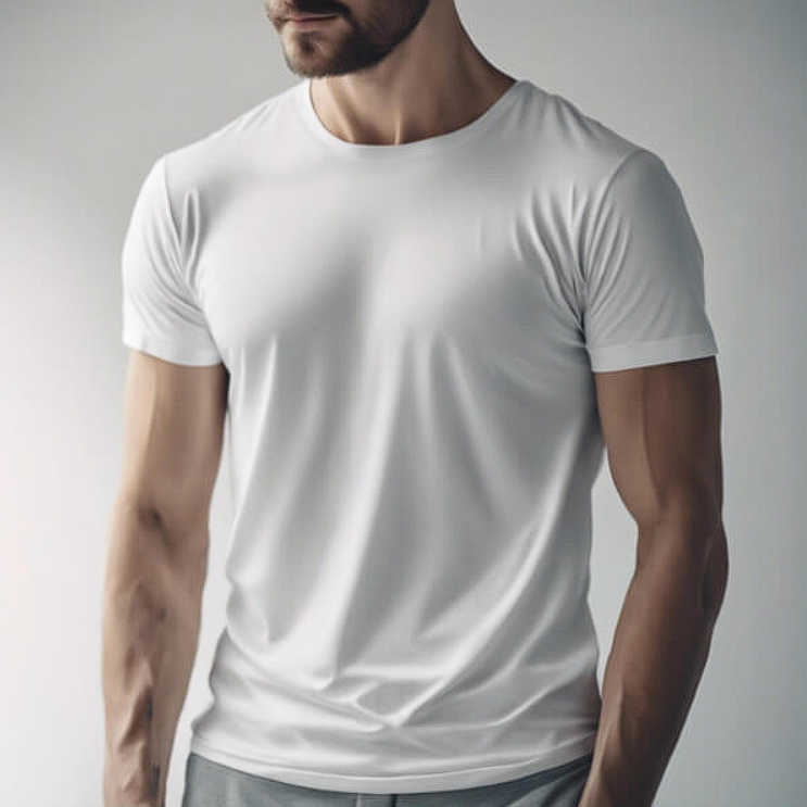
Sometimes the body matters more than the shirt. This image of a man with a well-defined physique wearing a simple white t-shirt against a soft, neutral background is a classic for a reason. The lighting gently highlights the contours of his arms and chest. The confident stance creates an appealing aesthetic. I use this mockup for fitness brands, athleisure, and any project where the wearer’s lifestyle matters as much as the garment. My advice. If your target audience aspires to a certain body type or lifestyle, show them that body type. Aspiration sells. Reality just exists.
Check out this T-Shirt Mockup now.
Assorted Unisex T-Shirts in White, Brown, and Beige Colors
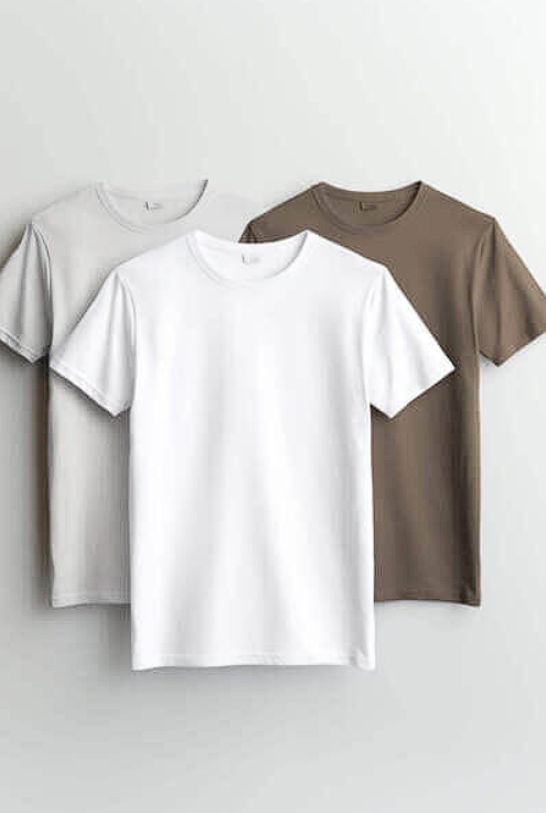
Choice is powerful. This image showcases three unisex t-shirts in white, brown, and beige hung on a white background. Each shirt has its own distinctive design. I use this mockup when I want to show a collection, not a single product. It signals range, versatility, and options. Here is the pro move. When presenting multiple colorways, use a mockup that shows them together. It helps clients visualize the full offering. A single shirt is a sample. Three shirts are a collection. Perception shifts with quantity.
Check out this T-Shirt Mockup now.
Mannequins in White T-Shirts on Grey Background
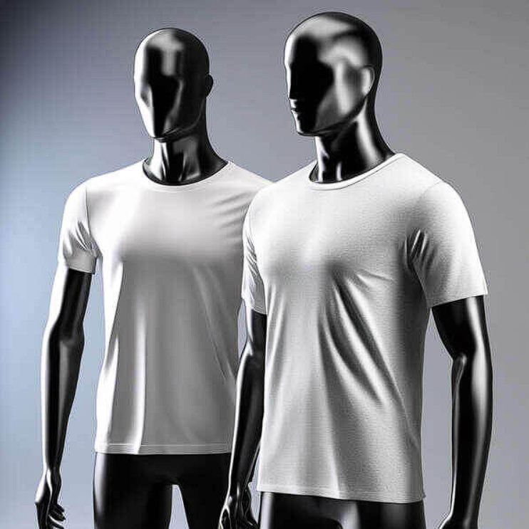
Two mannequins are better than one. This image features two mannequins dressed in white t-shirts, standing next to each other on a grey background with their heads tilted towards one another. The space between them offers potential for storage or display. I use this mockup when I need to show a product from multiple angles or when I am presenting a couples or friends collection. The interaction between the mannequins suggests relationship and connection. My advice. Use paired mannequins for brands that sell community, not just clothing. Streetwear. Couples merchandise. Friendship collections.
Check out this T-Shirt Mockup now.
White T-Shirt Displayed for the Holidays
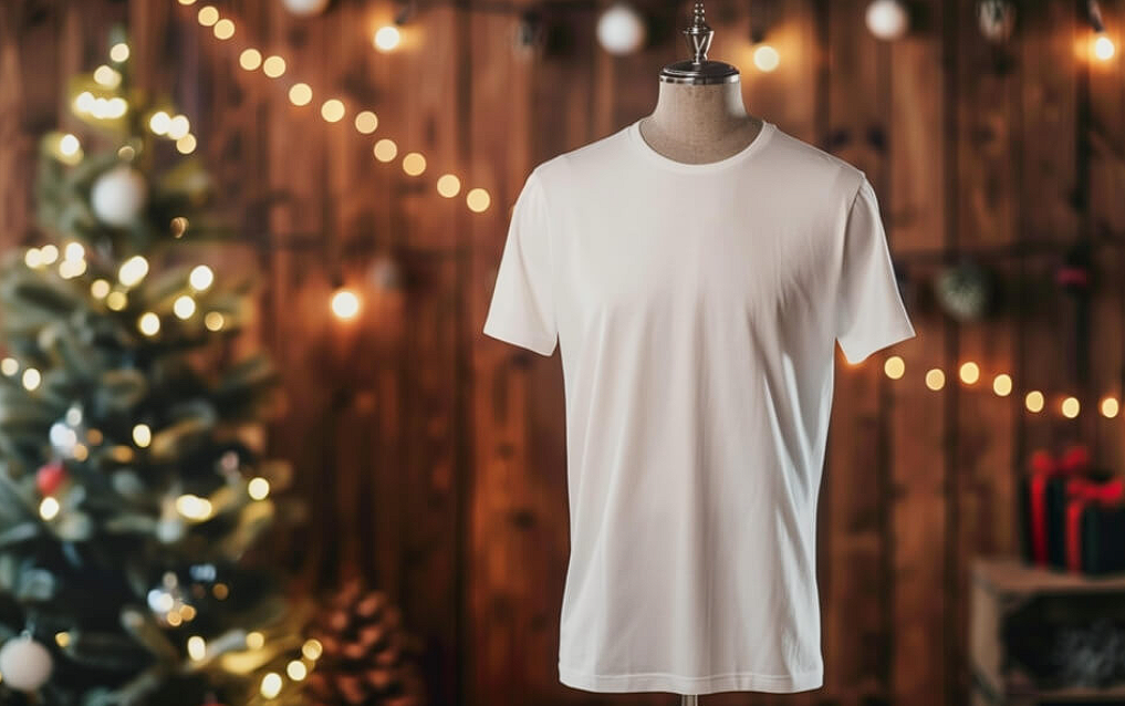
Christmas comes every year. And every year, designers scramble for holiday visuals. This mockup with a plain white t-shirt on a mannequin against a rustic wooden background with festive lights and a Christmas tree is my December secret weapon. The warm, glowing lights create a cozy, inviting atmosphere. I used this for three different holiday campaigns last year. The client never complained about the mockup. They just approved the designs. Why? Because the scene already felt like Christmas. The shirt was just the canvas. Use this when you need to sell a feeling, not a product.
Check out this T-Shirt Mockup now.
Mockup of Three White T-Shirts for Custom Printing
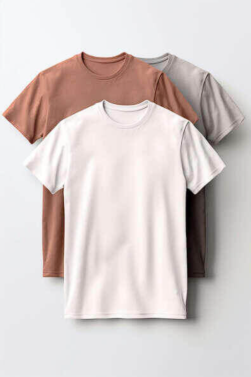
Stacked shirts tell a different story than hanging ones. This photorealistic mockup of three white t-shirts stacked on top of each other on a white background is built for one purpose. Custom printing presentations. The stack says “these are ready to be produced.” The white background says “focus on the print area.” I use this for manufacturers, print shops, and bulk order presentations. Here is the rule. Use stacked mockups for production conversations. Use lifestyle mockups for marketing conversations. Never mix the two. One is about logistics. The other is about desire.
Check out this T-Shirt Mockup now.
Two People in Ghost Masks in Wooded Area
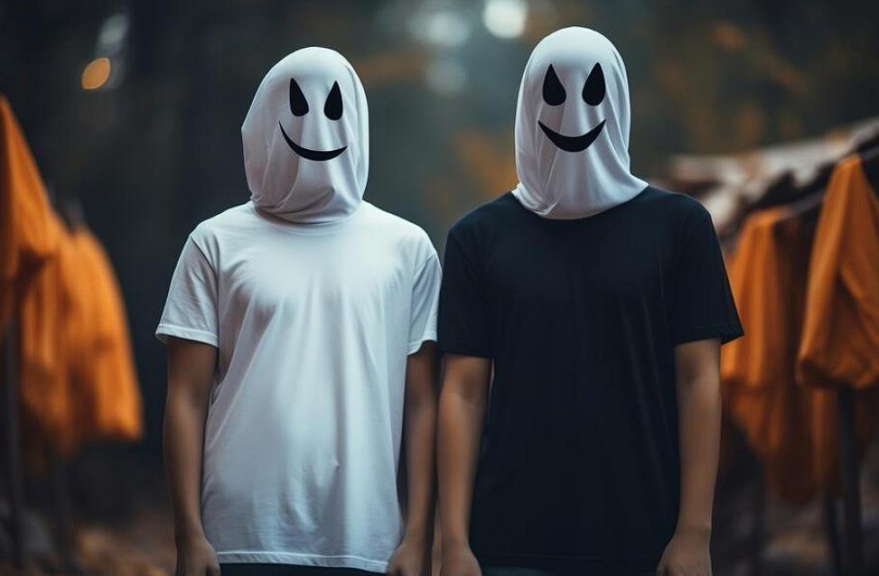
This is the weirdest mockup on the list. And that is exactly why I love it. Two people in ghost masks, white t-shirts, and black shorts standing in a wooded area with tents in the background. This is not a typical fashion shot. But it is a perfect Halloween scene. I used this for a horror themed pop up shop. The client said it was “exactly the vibe we wanted.” My advice. Sometimes the best mockup is not the most beautiful one. Sometimes it is the most appropriate one. A weird mockup in the right context is brilliant. A beautiful mockup in the wrong context is invisible.
Check out this T-Shirt Mockup now.
Blank White T-Shirt Hanging on Wooden Hanger
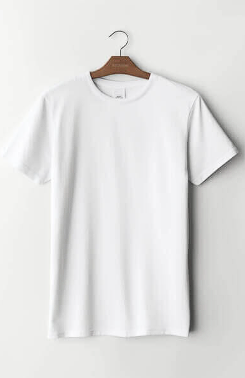
The wooden hanger is a signal. It says “this is not fast fashion. This is quality.” This empty white t-shirt hanging on a wooden hanger against a softly lit background is simple, clean, and classic. I use this mockup for brand lookbooks, catalog pages, and any presentation where the garment needs to feel permanent, not disposable. Here is the psychology. Plastic hangers signal cheap. Wooden hangers signal premium. Metal hangers signal industrial. Choose your hanger like you choose your font. It sends a message.
Check out this T-Shirt Mockup now.
White T-Shirt Displayed in Clothing Store
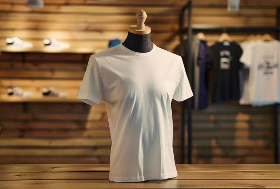
Context is credibility. This image features a plain white t-shirt on a mannequin within a stylish clothing store with wooden shelves showcasing shoes and additional clothing. The modern retail environment signals that this product is sellable, not just theoretical. I use this mockup when I need to convince a client that their design belongs on a shelf, not just a screen. The lighting highlights the fabric texture. The background says “this is real commerce.” My advice. Use retail environment mockups for commercial brands and mass market products. Use studio mockups for luxury and conceptual work. The setting tells the story.
Check out this T-Shirt Mockup now.
White T-Shirt Displayed for Christmas
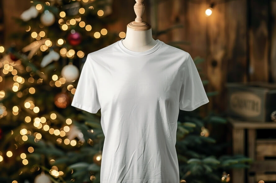
Another Christmas scene, but this one is different. This mockup features a plain white t-shirt on a mannequin in front of a beautifully decorated Christmas tree with warm lights and colorful ornaments in a softly blurred background. The shirt stands out prominently against the vibrant holiday setting. I used this for a corporate holiday gift campaign. The client wanted to feel festive but not overwhelming. This delivered. The key is the blur. The tree is there. The lights are there. But they do not compete with the shirt. Blur is a tool. Use it to create atmosphere without distraction.
Check out this T-Shirt Mockup now.
Close-up of a Person in a White T-Shirt
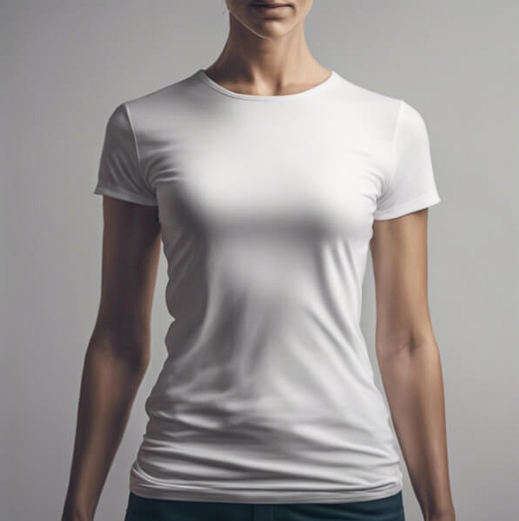
Close-ups are intimate. This image features a close-up view of a person wearing a fitted white t-shirt, facing the camera with a neutral background. The snug fit highlights the contours of the body. The soft lighting enhances the smooth texture of the fabric. I use this mockup when I need to show fabric quality, neckline details, and fit precision. Wide shots show the whole garment. Close-ups show the quality. Both are necessary. My advice. Always include at least one close-up in your presentation. It signals that you care about the details that clients often overlook.
Check out this T-Shirt Mockup now.
Profile of a Woman in a Black T-Shirt
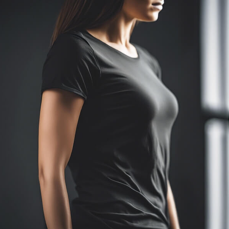
Profile shots are underused. This image features a close-up profile of a woman wearing a fitted black t-shirt with soft lighting highlighting the contours of her body and fabric. The dark background accentuates her silhouette. Long, flowing hair adds to the aesthetic. I use this mockup when I want to show how a garment drapes from the side. Front shots show the print. Side shots show the cut. Both are necessary for a complete presentation. Here is the rule. Show front for design. Show side for fit. Show back for detail. Cover all three and clients have nothing to ask.
Check out this T-Shirt Mockup now.
Customizable White T-Shirt on Pink Background
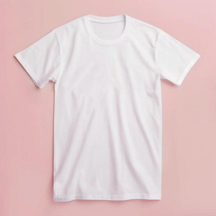
Pink backgrounds are polarizing. Some clients love them. Some hate them. That is why this mockup with a white t-shirt on a pink background with empty space for text or logos is a strategic choice. I use this only when I know the client’s brand palette includes pink or when the target audience is predominantly female. My advice. When using bold background colors, always check with the client first. A beautiful mockup on the wrong color can tank an entire presentation. Color is emotional. Use it intentionally.
Check out this T-Shirt Mockup now.
Close-up of a Male Figure in Black T-Shirt
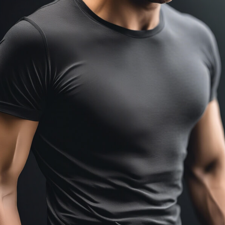
Muscle and fabric. This combination has sold more athletic wear than any marketing campaign. This close-up view of a muscular male figure in a fitted black t-shirt against a dark background highlights the contours of his body and the smooth texture of the fabric. The focus is on the upper torso and arms. I use this mockup for gym brands, fitness apps, and any project targeting men who value strength and aesthetics. My advice. Use physique focused mockups for performance brands. Use lifestyle focused mockups for casual brands. The body says what the brand cannot.
Check out this T-Shirt Mockup now.
Minimalist White T-Shirt on Wooden Hanger
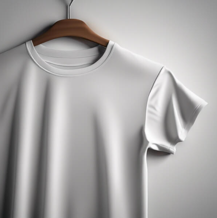
Warm wood meets cool white. This combination is timeless. This image features a plain white t-shirt hanging on a wooden hanger against a softly lit background. The smooth fabric showcases a casual and minimalist design. The warm wood texture contrasts gently with the monochromatic shirt. I use this mockup for basic collections, essentials, and any brand that values simplicity over trend. Here is the lesson. Simple mockups work for simple brands. Do not overcomplicate a minimalist presentation. Let the product breathe. The hanger does the work.
Check out this T-Shirt Mockup now.
Black T-Shirt on Hanger
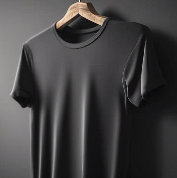
Black is the most difficult color to present well. This image features a black t-shirt elegantly displayed on a wooden hanger against a solid dark background. The smooth fabric catches the light, creating soft shadows that accentuate shape and texture. I use this mockup when I need to show that a black shirt is not just “black.” It has texture. It has depth. It has quality. Here is the trick. Always use a wooden hanger with black shirts. The warmth of the wood lifts the heaviness of the black. Plastic against black looks cheap. Wood against black looks premium.
Check out this T-Shirt Mockup now.
Man in White T-Shirt Against Gray Background
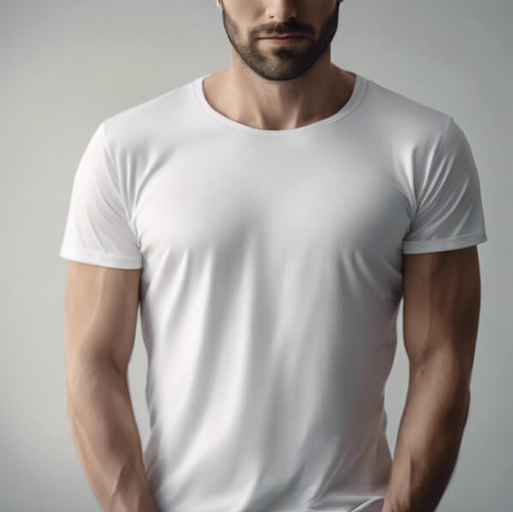
Gray is the great equalizer. This photo features a man wearing a fitted white t-shirt with a strong physique against a minimalistic gray background. The soft lighting highlights the contours of his body. The calm, composed expression adds to the aesthetic. I use this mockup when I want the shirt to feel sophisticated without being cold. Gray says “professional.” White says “clean.” Together, they say “premium casual.” My advice. Use gray backgrounds for brand presentations and client pitches. The neutrality keeps the focus on the garment while still feeling intentional.
Check out this T-Shirt Mockup now.
Stylish White T-Shirt on Beige Background
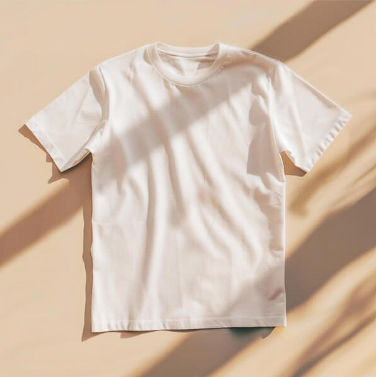
Beige is having a cultural moment. And for good reason. This image with a white t-shirt laying on a beige background with sunlight behind it creates warmth, softness, and approachability. The unbuttoned shirt suggests casual wear for both men and women. I use this mockup for lifestyle brands, unisex collections, and any project that values comfort over structure. Here is the rule. Use beige for brands that want to feel human. Use white for brands that want to feel clinical. Use gray for brands that want to feel professional. Each background sends a distinct signal.
Check out this T-Shirt Mockup now.
Here is what I want you to remember. T-Shirt Mockups come in many forms, and each one serves a different purpose. A shirt on a mannequin tells a retail story. A shirt on a wooden hanger tells a quality story. A shirt on a flat surface tells a production story. A shirt on a human body tells a lifestyle story. None of these is better than the others. They are just different tools for different conversations. The key is knowing which story your client needs to hear at that moment. A manufacturer needs to see the print area. A marketer needs to see the lifestyle. A boutique owner needs to see the retail context. Choose your mockup like you choose your words. With intention. With strategy. With the client’s needs in mind. Now go make your t-shirt designs feel like they already belong somewhere real.