
Computer Mockups
Here is a hard truth I learned after losing a website redesign pitch. My designs were beautiful. The typography was flawless. The spacing was perfect. But I presented everything on flat, lifeless screen grabs. The client could not imagine how the site would actually feel. Now I never show a homepage, landing page, or portfolio without placing it inside real Computer Mockups. In this article, I will walk you through my curated collection of mockups specifically for presenting website designs. I will tell you which ones make your work look expensive, which ones keep focus on your layout, and which ones have saved me from endless client revisions. No tech talk. Just professional advice for graphic designers who want their digital work to sell itself.
Neat and Organized Workspace with Technology Devices
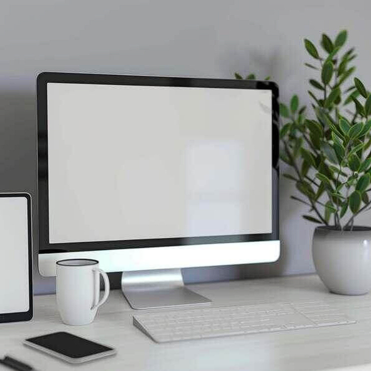
Clutter kills credibility. This image features a desktop computer, two cell phones, and an iPad sitting neatly on a desk with a potted plant. The monitor faces directly toward the viewer. I use this mockup when I need to show responsive website designs across multiple devices at once. One presentation. Desktop version on the main screen. Mobile versions on the phones. Tablet version on the iPad. My advice. Keep the devices consistent. A dark themed website on a white phone frame looks disconnected. Match your mockup hardware to your design personality.
Check out this Computer Mockup now.
Computer Monitor, Keyboard, and Mouse with Abstract Orange Design
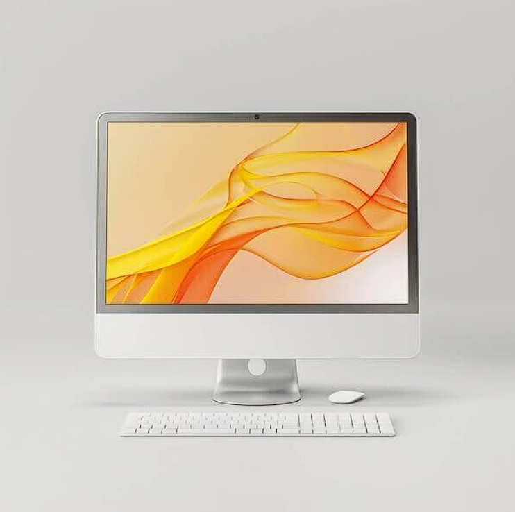
Sometimes your website needs to feel creative. This image showcases a monitor, keyboard, and mouse with an orange colored abstract design on a white background. I used this for a creative agency portfolio site. The orange abstract pattern whispered “design” without screaming. Here is the rule. Use abstract or colored mockups when your website itself is minimal or monochrome. The mockup adds visual interest. Use neutral mockups when your website is already busy with color and texture. Never let your mockup compete with your work.
Check out this Computer Mockup now.
Sleek Computer Monitor on White Background
Minimalism is strategic. This image features a sleek, modern computer monitor with a thin black frame and metallic stand against a plain white background. The screen is unlit and blank. I reach for this mockup when I want absolute focus on the website itself. No desk. No plant. No distractions. Your homepage becomes the only thing the client sees. I use this for final approvals before development. It removes every excuse. “Is that the actual spacing?” Yes. Nothing else is in the frame. Look at the work.
Check out this Computer Mockup now.
Pink Computer Monitor on White Cube
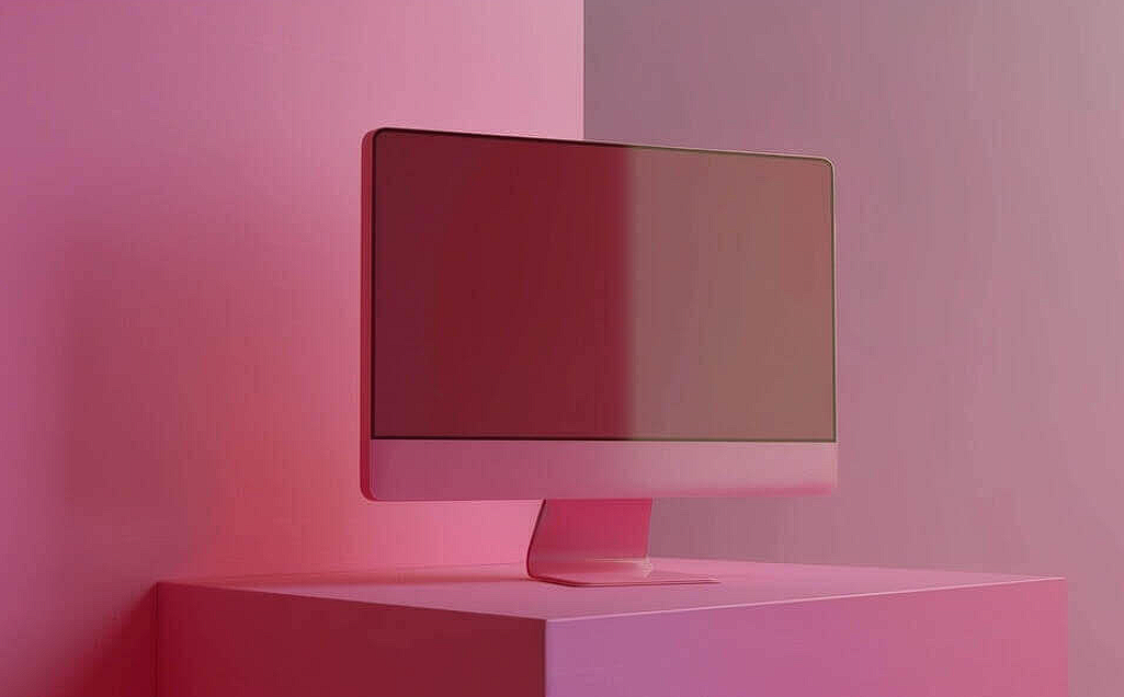
Angles change perception. This image showcases a pink colored computer monitor placed on an empty white cube, tilted toward the viewer. I once presented a lifestyle brand website using standard front facing mockups. The client said it felt flat. Switched to this angled shot. Approved immediately. The tilt creates depth. It makes your website feel three dimensional on a two dimensional screen. My tip. Use angled mockups for hero sections and portfolio pieces. Use straight on shots for detailed layout reviews. Know which job each angle is built for.
Check out this Computer Mockup now.
Abstract White Computer Monitor Display
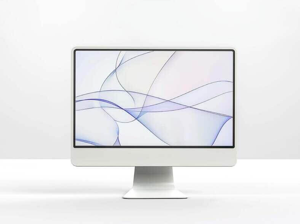
Mystery has its place. This image showcases a white computer monitor with an abstract pattern on the screen against a white background, creating a floating illusion. I use this mockup for one specific scenario. Concept presentations where the website design is not yet finalized. The abstract screen says “imagine the possibilities here” instead of “judge every pixel now.” It buys you time and creative freedom. Keep this for early stage conversations. Never use it for final deliverables.
Check out this Computer Mockup now.
White Computer Monitor, Keyboard, and Mouse with Pink Background
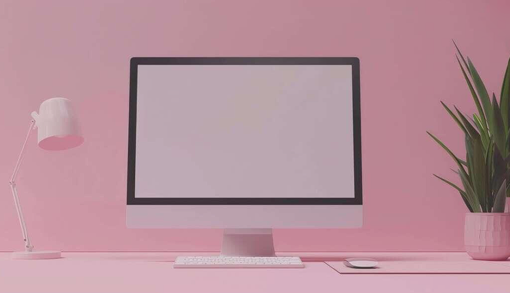
Background color sets the mood. This image features a white monitor, keyboard, mouse, plant, and lamp arranged in front of a pink background with office supplies visible. The monitor faces the viewer, creating engagement. I used this for a wellness brand website. The pink background signaled softness before the client even looked at the screen. Here is the lesson. Background color is not decoration. It is emotional priming. Pink for wellness. Blue for corporate. Yellow for creativity. Choose intentionally.
Check out this Computer Mockup now.
Empty Computer Monitor on Blue Table
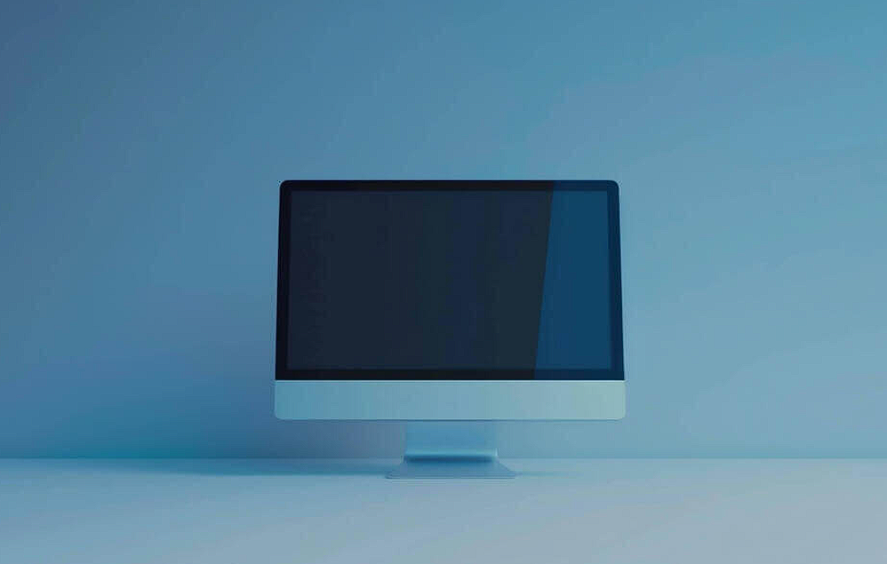
Negative space directs attention. This image showcases an empty computer monitor positioned on a blue colored table. The blank screen suggests potential. I love this mockup for presenting e commerce website designs. Why? The blue table adds just enough color to be interesting without stealing focus from your product images and layouts. My advice. Match the table or desk color to a secondary color from your website palette. Small alignments like this make your presentation feel custom, not templated.
Check out this Computer Mockup now.
Black Computer Monitor on White Table
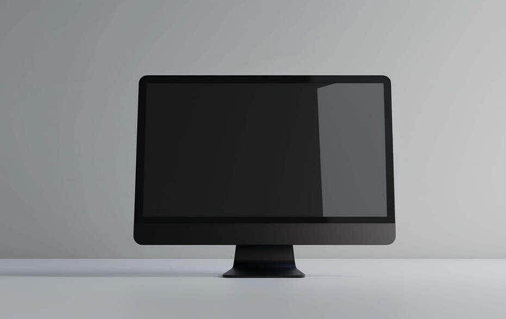
Sometimes you need silence. This image features a black computer monitor placed on an empty white table, tilted away from the camera with the screen facing upward. I use this mockup for internal design reviews and client check ins where the goal is feedback, not admiration. The tilt away says “we are examining this work, not selling it yet.” Use this when you want honest critiques without the polish of a final presentation.
Check out this Computer Mockup now.
Computer Monitor on White Cube
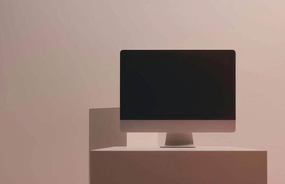
Centered composition forces focus. This image displays a computer monitor positioned on an empty white cube, centrally framed with the screen oriented away from the viewer. I learned something valuable from this mockup. Hiding the screen content builds curiosity. I use this for email newsletters and social media teasers announcing a upcoming website launch. No screen details means people click through to see more. It is a simple psychological trick. What you hide becomes more interesting than what you show.
Check out this Computer Mockup now.
Empty Computer Monitor on Sunlit Desk
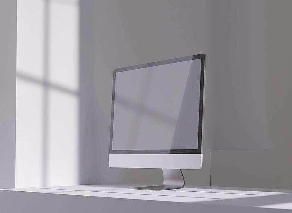
Natural light sells lifestyle. This image features an empty computer monitor on a desk with sunlight streaming through a window. The workspace is uncluttered. The mood is calm. I presented a slow living blog website using this mockup. The client said it “felt like Sunday morning.” That emotional reaction came from the light, not the design. My advice. Use sunlit mockups for lifestyle blogs, wellness sites, and creative portfolios. Avoid them for corporate or finance websites. Light sets the emotional tone before anyone reads a single word of your copy.
Check out this Computer Mockup now.
White Computer Monitor, Keyboard, Mouse, and Plant in a Well Furnished Room
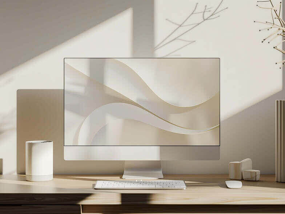
Details tell a story. This image features a white monitor, keyboard, mouse, and plant with an empty vase and two bookshelves in the background. The room feels lived in, not staged. I used this for a remote work blog and a freelance portfolio site. The background bookshelves signaled that a real person, not a corporation, built this website. Here is the pro move. When presenting personal brands, creative portfolios, or small business sites, use mockups with warm, human details. Books. Plants. Vases. It builds trust.
Check out this Computer Mockup now.
Computer Monitor on Pink Wall
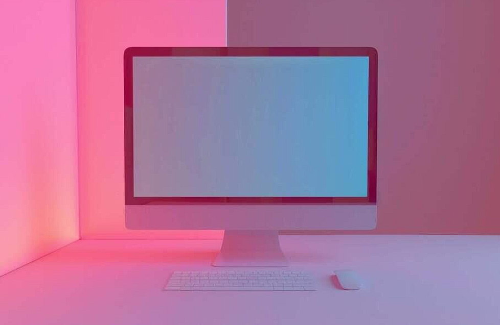
Bold backgrounds demand bold websites. This image showcases a monitor, keyboard, and mouse set up against a pink colored wall. I have seen designers ruin this by dropping in low contrast website designs. Here is the rule. Pink walls need dark or high saturation screen content. White backgrounds disappear. Light grays get washed out. Black or navy interfaces pop. Know your contrast ratios before you place your design. A beautiful mockup means nothing if your website becomes unreadable.
Check out this Computer Mockup now.
Modern Computer Monitor on Yellow Background

Yellow is a statement. Use it only when your website can back it up. This image features a blank computer monitor on a vibrant yellow background with a white keyboard and mouse. I love this mockup for creative portfolios, design agency sites, and anything targeting young, bold audiences. But I never use it for law firms, banks, or healthcare. Yellow signals energy and risk. Your website needs to match that energy. A safe, corporate layout on a yellow background looks confused. Match the mockup to the design personality.
Check out this Computer Mockup now.
White Computer Monitor, Keyboard, and Mouse on Desk with Empty Space
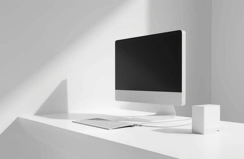
Leave room for context. This image showcases a white monitor, keyboard, mouse, and other peripherals neatly arranged on a desk with an open space in the middle. A light source is visible on the right side. That open space is an invitation. I use this mockup when I need to add custom elements that support the website story. A notebook with sketches. A coffee cup. A wireframe printout. The composition gives me room to layer without crowding. My tip. Keep added elements relevant to the website. Do not add a latte just because it looks trendy. Add it because the brand drinks coffee.
Check out this Computer Mockup now.
Workspace with Computer Monitor, Smartphones, and Electronic Keyboard
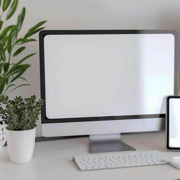
Cross device storytelling is powerful. This image features a workspace with a computer monitor, two smartphones, an electronic keyboard, and a potted plant. I used this for a music education website and an audio production blog. One mockup showed the desktop version, mobile experience, and brand lifestyle in a single frame. The client understood the full vision immediately. That is the power of showing ecosystem, not isolation. Use this when your website has mobile, desktop, and real world applications.
Check out this Computer Mockup now.
Modern Computer Monitor on Turquoise Background
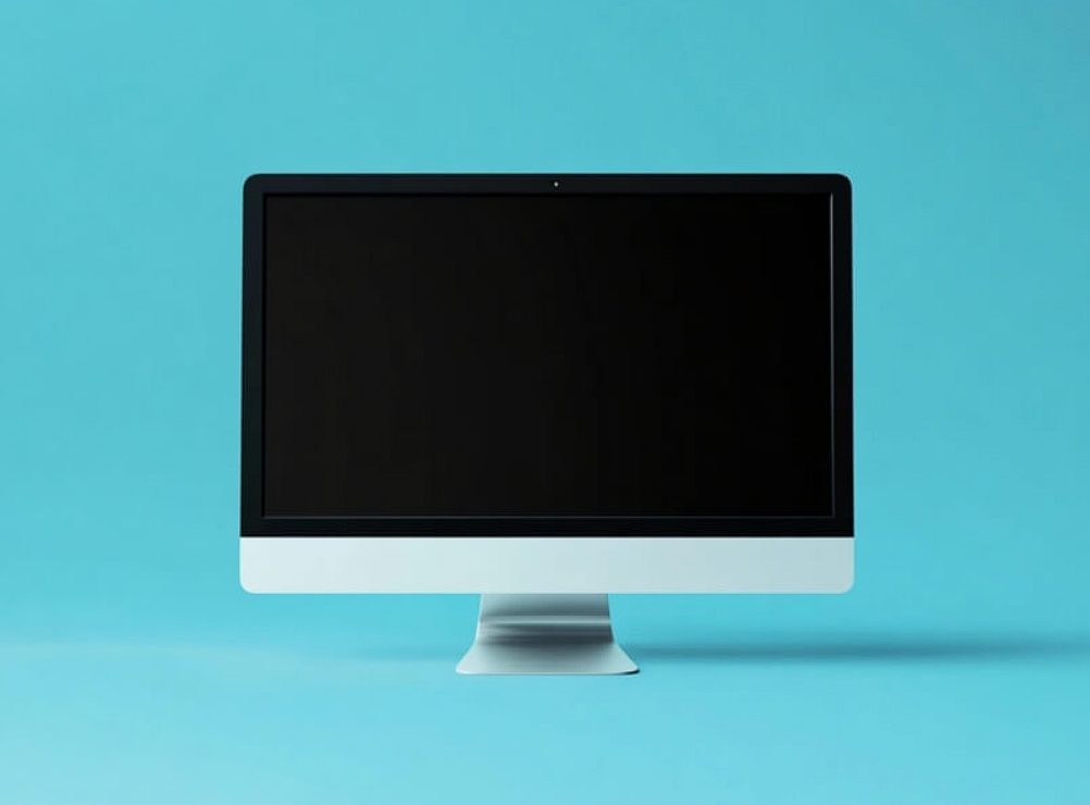
Turquoise is the professional’s creative color. This image features a sleek, modern computer monitor with a black screen set against a vibrant turquoise background. I reach for this mockup when I need a website to feel both capable and approachable. Tech startups. Design agencies. Creative consultants. Turquoise sits in a beautiful middle ground. Not as cold as blue. Not as loud as orange. Use this when your website needs to say “we are creative and you can trust us.”
Check out this Computer Mockup now.
Computer Setup with Desert Landscape Background
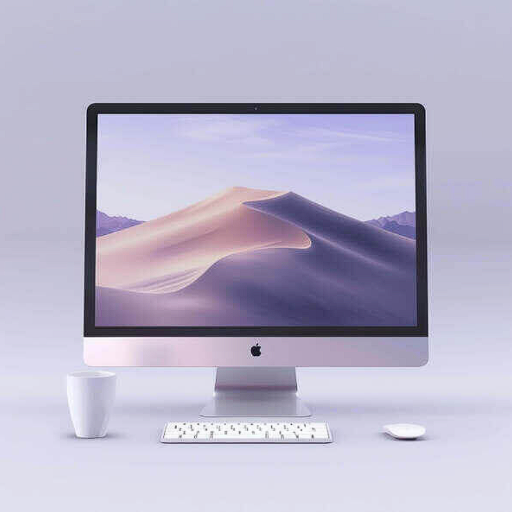
Unusual mockups create unforgettable moments. This image features a computer monitor, keyboard, mouse, and cup with a desert landscape visible in the background. Two cups sit on the table. I have only used this once, for a travel blog website. But it was perfect for that project. The lesson is this. Not every website presentation needs to look like a corporate office. Some need to transport the viewer. Use this for travel, adventure, or lifestyle brands that want to feel different. Novelty has its place. Just use it intentionally.
Check out this Computer Mockup now.
Modern Desktop Computer Setup on Orange Background
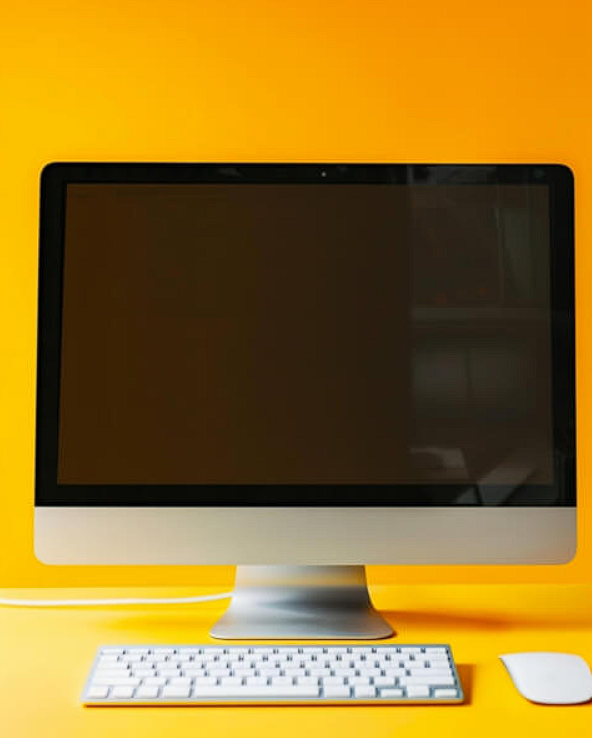
Orange is commitment to energy. This image features a modern desktop computer set against a vibrant orange backdrop with a black screen, white keyboard, and mouse. I learned a hard lesson with this mockup. Orange looks incredible on my calibrated monitor. On a client’s cheap laptop screen, it can feel aggressive and overwhelming. Always test your mockups on multiple displays before presenting website designs. What feels bold and creative to you might feel loud and unprofessional to them. Know your client.
Check out this Computer Mockup now.
Computer Monitor on Pink Cubes
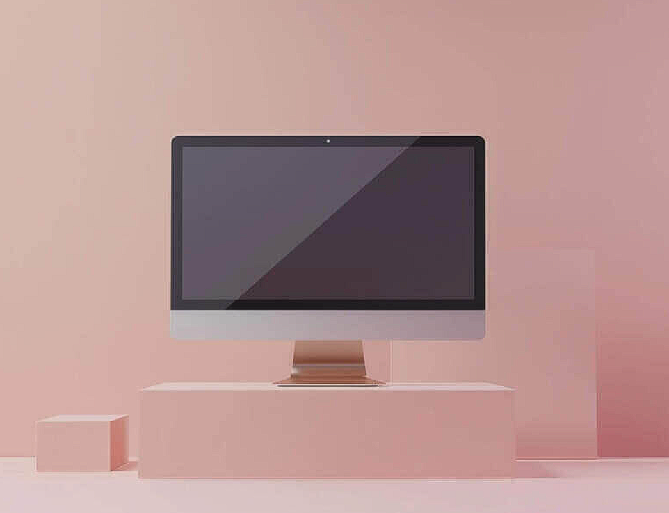
Playful presentation has its moment. This image showcases a computer monitor positioned on top of two pink cubes against a pink background. I used this for a youth focused lifestyle brand website. The client specifically asked for “something that does not look like every other boring startup.” This delivered. My advice. Use unconventional bases like cubes, rocks, or geometric shapes for brands that value creativity and differentiation. Use standard desks for corporate or conservative clients. Form follows brand identity. Always.
Check out this Computer Mockup now.
Inactive Computer Monitor on White Tabletop
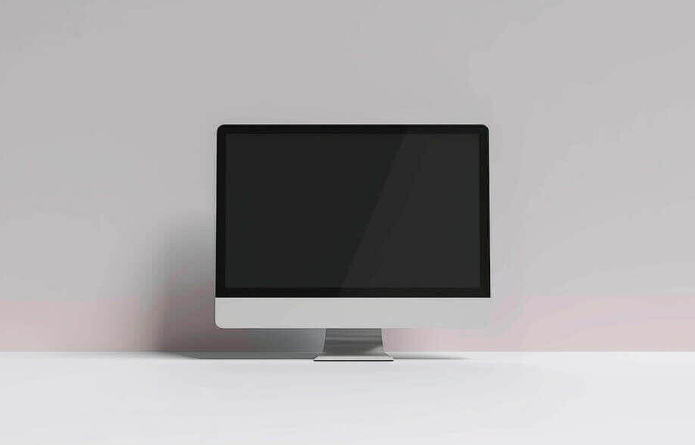
Ending with honesty. This image showcases an inactive computer monitor placed on a white tabletop with the screen facing away from the viewer. I love this mockup for one specific use case. Before and after presentations. Show the inactive monitor as the “before” shot. Then reveal your redesign on an active screen. The contrast between empty and full makes your work look even more impressive. Do not overlook humble mockups. Sometimes they are the perfect setup for your big reveal.
Check out this Computer Mockup now.
After a decade of presenting website designs, I can say this with confidence. Computer Mockups are not decoration. They are the frame around your art. The right mockup makes your homepage look expensive, your layout feel intentional, and your brand story land without a single word of explanation. The wrong mockup distracts, confuses, and cheapens work you spent hours perfecting. So stop dropping screenshots onto blank backgrounds and calling it a day. Choose mockups that respect your design. Match the mood. Control the lighting. Leave room for the story. And never present a website until you have seen it inside a scene that does it justice.
Now go make your digital work feel like it already belongs somewhere beautiful