
Laptop Mockups
Here is a moment I will never forget. A client once told me my design looked “like a screenshot from a banking app.” It was not the design. It was the setting. I had presented it on a sterile gray laptop mockup with no personality, no warmth, no life. That comment stung because it was true. My work looked cold because I had placed it in a cold environment. That is when I finally understood. A design does not exist on its own. It exists wherever you put it. Put it in a coffee shop and it feels social. Put it on a wooden table and it feels natural. Put it next to flowers and it feels soft. Laptop Mockups are not frames. They are locations. And choosing the wrong location makes even the best work feel misplaced. In this article, I will show you the locations I use for different brands, different moods, and different clients.
Laptop Computer on Desk with Green Plants
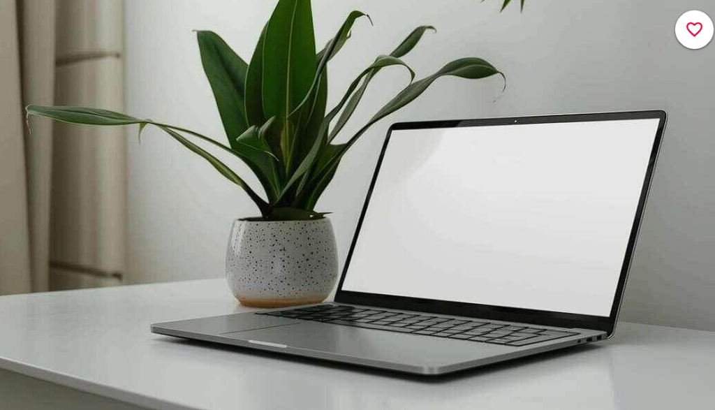
The psychology here is simple but powerful. Green plants near a laptop signal that technology does not have to feel cold. I once presented two versions of the same ecommerce site to a client. One on a plain white background. One next to a potted monstera. The plant version won in under a minute. The client said it “felt more alive.” Here is the uncomfortable truth. Clients are emotional, not logical. Use that knowledge wisely.
Check out this Laptop Mockup now.
Woman Working on Laptop with Books and Coffee Cups
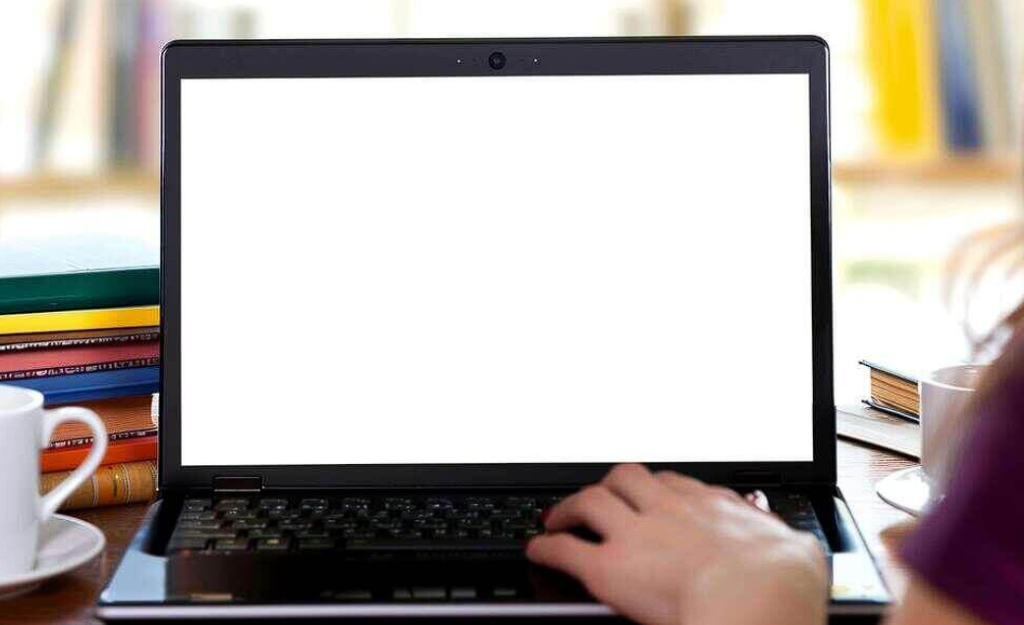
I almost lost a $20,000 project because of a missing coffee cup. True story. The client kept saying my designs looked “like a museum, not a workplace.” I swapped to this mockup with books scattered and a half empty cup visible. Approval came the next morning. What changed? The mess. Real workspaces are not tidy. Real people have multiple books open. Real coffee cups leave rings. This mockup works because it does not try to be perfect. It tries to be honest.
Check out this Laptop Mockup now.
Open Laptop Computer on Green Background
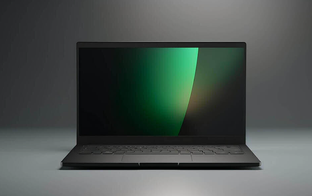
Most designers ignore background colors. That is a mistake. This green background is not subtle. It screams “nature, growth, sustainability.” I used this for a solar energy company website. The client literally said “I already feel better about this brand” before scrolling. The background did my pitch for me. My rule. Use aggressive background colors when you need to establish brand values fast. Use neutral backgrounds when you have time to explain. Speed matters.
Check out this Laptop Mockup now.
Laptop Computer with Empty Screen on White Table
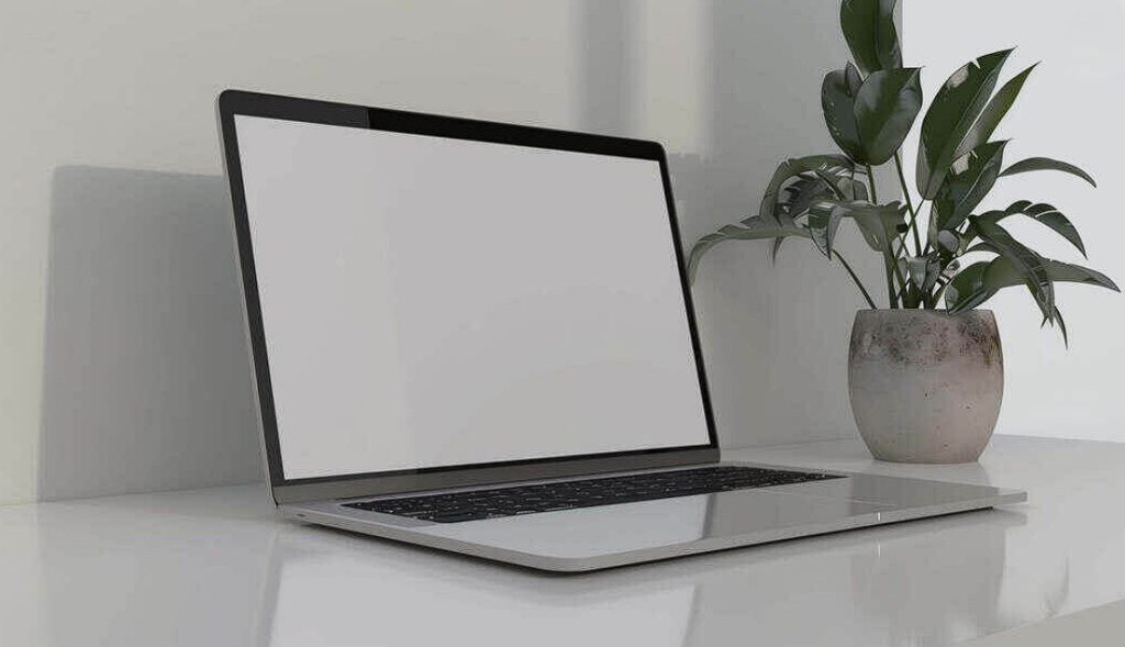
Empty space is a weapon. This white table with a single plant and a blank laptop screen forces the viewer to imagine. I use this mockup when I want clients to project their own dreams onto my design. A blank screen is not incomplete. It is an invitation. “What would you put here?” They start selling themselves. That is the highest level of presentation skill. Make them finish the story.
Check out this Laptop Mockup now.
Laptop and Pink Flowers on Table
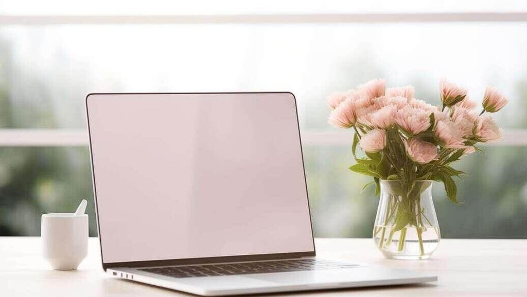
I used to avoid pink. I thought it was unprofessional. Then a wedding invitation client showed me her Pinterest board. It was all pink flowers, soft light, and laptop mockups. I learned something that day. Professional means matching the client’s world, not imposing your own. Pink flowers say romance, softness, and beauty. If your client sells weddings, flowers are not decoration. They are evidence that you understand them.
Check out this Laptop Mockup now.
Person Working on Laptop at Desk with Coffee Cup
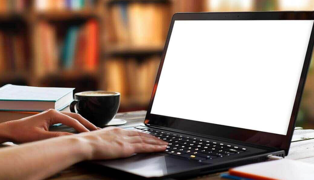
Here is a controversial take. Hands in mockups are good. Many designers avoid them because hands “distract.” I disagree. Hands prove that a real person will use your design. A disembodied floating screen feels like a ghost. A hand on a keyboard feels like a Tuesday morning. I use this mockup for productivity tools and B2B dashboards. Clients need to see someone working, not just something pretty.
Check out this Laptop Mockup now.
White Laptop Computer and Coffee Cup in a Room
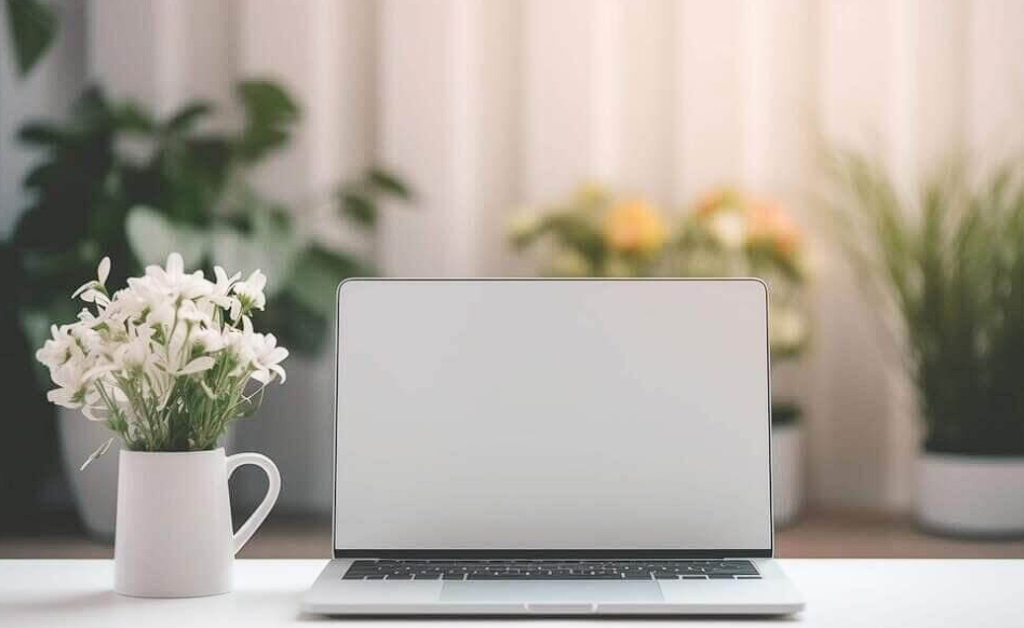
Notice what is missing from this scene. Chaos. No scattered papers. No second coffee cup. No phone. This mockup works for anxious clients. The ones who see mess and think “this designer is disorganized.” For those clients, I remove everything that suggests imperfection. Clean laptop. Single empty cup. Fresh flowers. No evidence of human struggle. Some clients need perfection to feel safe. Give it to them.
Check out this Laptop Mockup now.
Laptop Computer with Empty Screen on Gray Background
Gray is a lie detector. Put your design on a gray background and suddenly every spacing issue, every color mismatch, every typography mistake becomes visible. I use this mockup when I am judging my own work before a client sees it. If a design does not look good on gray, it does not look good anywhere. The bookshelves in the background add just enough depth to feel real while the gray keeps the focus harsh and honest. This is my self critique tool disguised as a mockup.
Check out this Laptop Mockup now.
Laptop Computer with Empty White Screen on Table
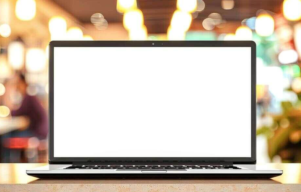
The people in the background are the point. This cafe scene with visible strangers tells a story that no solo workspace can. Your website design is not for you. It is for other people. Strangers. Customers. The blurred figures in the background remind the client that their brand exists in public, not in private. I use this for restaurant websites, event platforms, and any brand that lives in crowded spaces.
Check out this Laptop Mockup now.
Laptop, Coffee, and Plants on Outdoor Wooden Table
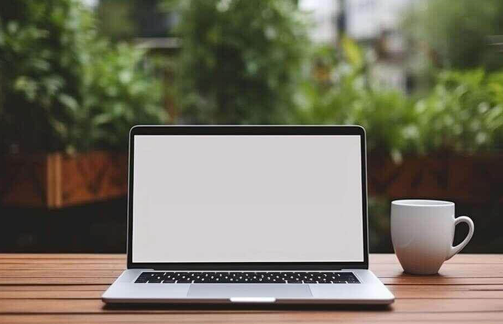
Fresh air sells freedom. I used this mockup for a remote work job board. The client wanted to attract digital nomads, not office workers. The outdoor wooden table said “no dress code, no commute, no cubicle.” Here is the trick. Every element of a mockup is a vote. Plants vote for calm. Coffee votes for comfort. Wood votes for natural. Outdoor votes for freedom. Total the votes before you choose. They will tell you exactly what story you are telling.
Check out this Laptop Mockup now.
Person Working on Laptop with Cup on Table

Look at the objects around the desk. Books. A cup. Various items. None of them are curated. None of them match perfectly. That is why this mockup works for creative clients. Designers and artists are suspicious of perfection. They see an immaculate desk and think “fake.” They see a slightly messy desk and think “real.” Know your audience. Corporate clients want perfection. Creative clients want authenticity. Choose accordingly.
Check out this Laptop Mockup now.
Stylish Workspace with White Laptop and Potted Flowers
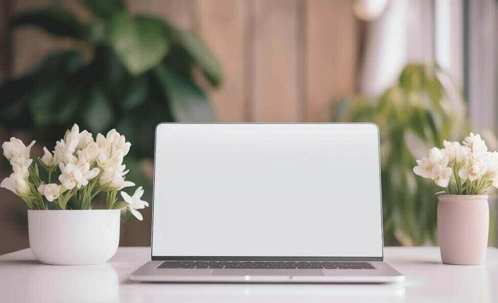
Natural light changes behavior. I have tested this. Present the same design in a dark, studio lit mockup and then in a bright, sunlit mockup. Clients spend more time on the sunlit version. They scroll slower. They ask fewer critical questions. Daylight signals honesty. Studio light signals manipulation. Use natural light when you want trust. Use studio light when you want drama.
Check out this Laptop Mockup now.
Open Laptop Computer and Coffee on White Table
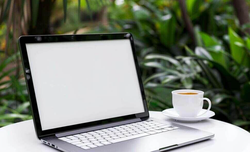
The white table is a commitment. White shows every crumb, every smudge, every imperfection. That is why this mockup works for luxury brands. Luxury cannot hide. A white table says “we have nothing to cover up.” Use this for premium products, high end services, and any brand that wants to signal cleanliness as a value. But never use it for a budget brand. White tables expose cheap materials.
Check out this Laptop Mockup now.
Laptop and Potted Plant on Wooden Table
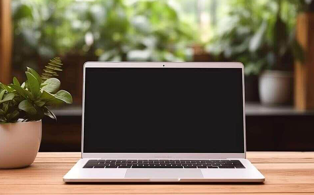
Wood grain adds texture. That is obvious. But here is what is not obvious. Wood signals aging. A wooden table has existed for years. It will exist for years more. That subconscious message says “this brand has staying power.” I use this mockup for established businesses, heritage brands, and any client who wants to feel permanent. Not trendy. Not disposable. Permanent.
Check out this Laptop Mockup now.
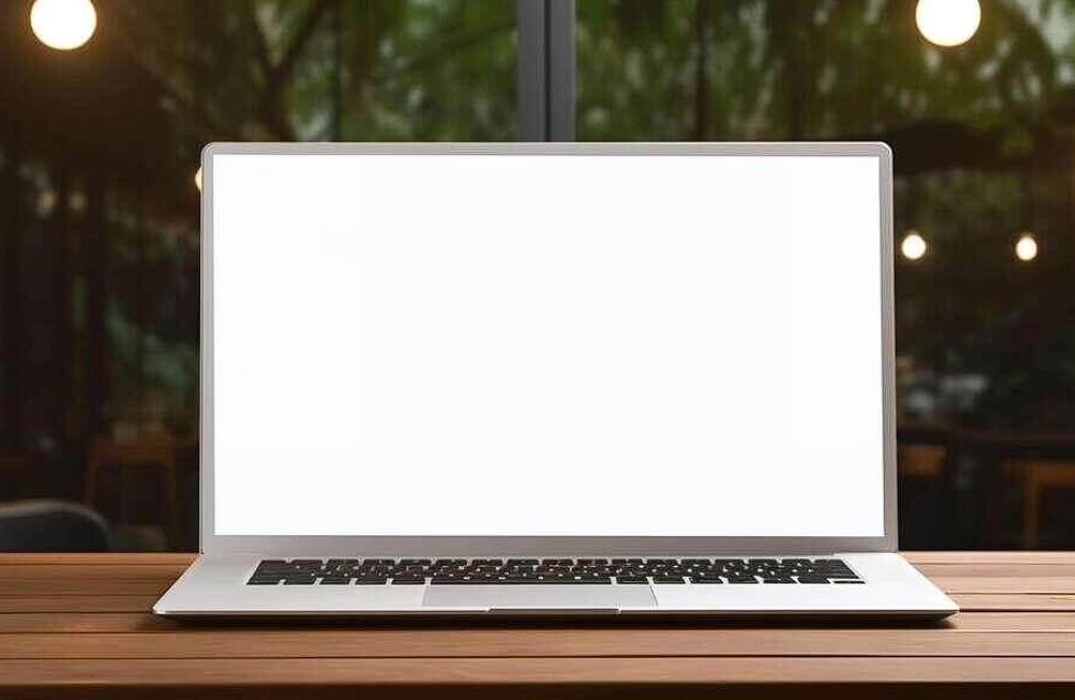
Laptop on Wooden Table in Restaurant or Bar with Blank Screen
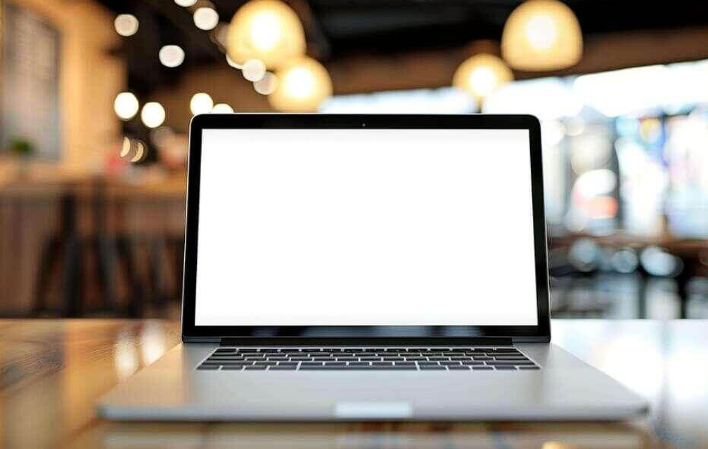
The lights in the background are out of focus. That is called bokeh. And bokeh sells nightlife. When I present bar or restaurant websites, I choose mockups with blurred background lights every time. The blur forces focus on the laptop while the lights whisper “evening, energy, social.” My advice. Use bokeh for brands that live after 6 PM. Use sharp, clear backgrounds for brands that live during business hours. Blur is not random. Blur is a time machine.
Check out this Laptop Mockup now.
Open Laptop with Desert Scene on Screen
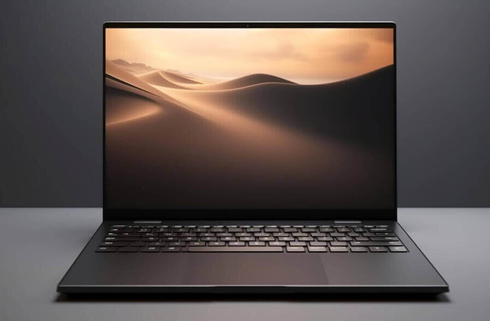
This mockup is unusual. A desert on the screen. A laptop in the real world. The two do not match. That mismatch is the point. I use this mockup when I want to sell potential, not reality. The desert says “you could be anywhere.” The laptop says “but you are here.” It is a tension that works for travel brands, dreamers, and anyone selling escape. Do not use this for logistics or accounting. They do not want escape. They want spreadsheets.
Check out this Laptop Mockup now.
Laptop Computer on Orange Table with Blank Screen
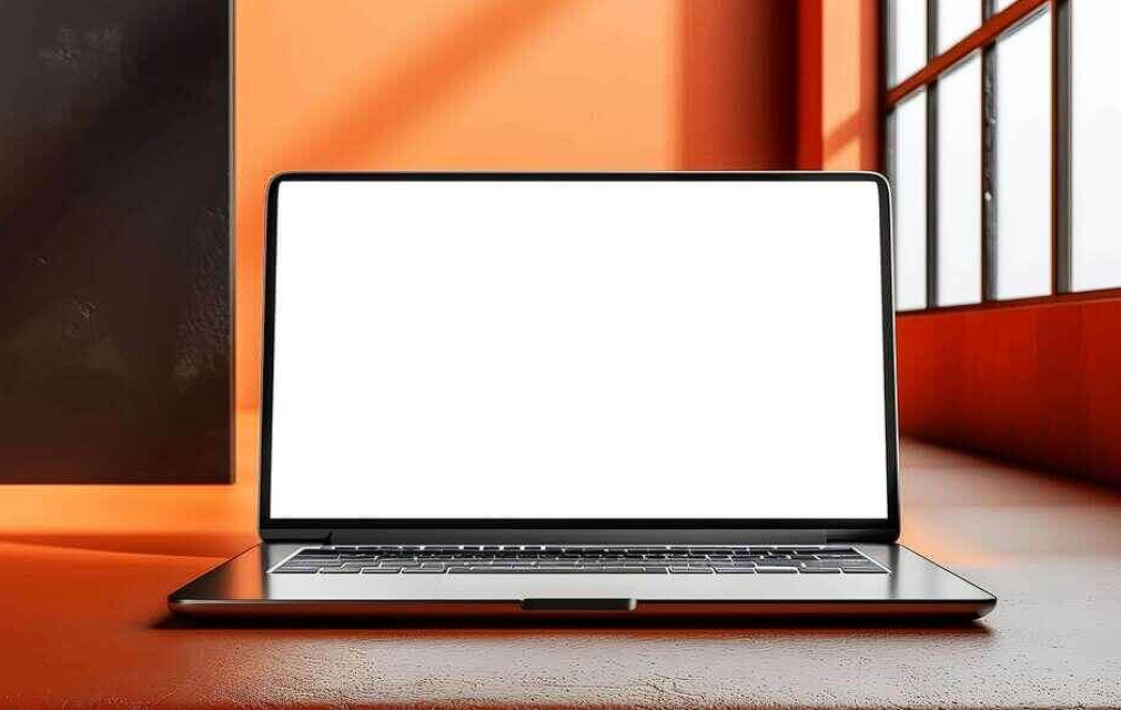
Orange tables are rare in mockups. That rarity is valuable. I used this for a design conference website. Every other presenter used white or wood tables. I stood out immediately. Here is the lesson. Sometimes the best mockup is not the most appropriate one. Sometimes it is the one that no one else is using. Novelty captures attention. Just make sure your design is strong enough to hold it.
Check out this Laptop Mockup now.
Laptop Computer on Orange Background
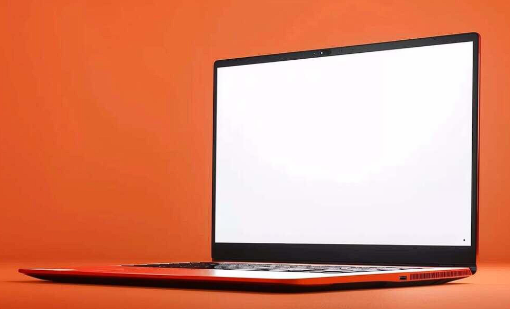
Orange is the least used background color in professional presentations. That is exactly why I use it. Orange signals courage. It says “I am not afraid to be seen.” I use this mockup for portfolio pieces where I want to show confidence. But here is the warning. Orange also signals risk. A client who hates orange will reject everything on the screen without looking at your work. Use orange only when you know your client’s color preferences. Otherwise, you are gambling.
Check out this Laptop Mockup now.
Laptop on Outdoor Wooden Table with Blank Screen
The plants around this table are not centered. They are scattered. Imperfect. That imperfection signals authenticity. A perfectly staged outdoor scene looks like a catalog. A slightly imperfect outdoor scene looks like a memory. I use this for lifestyle brands, personal blogs, and any project where honesty matters more than polish. Perfection is for products. Imperfection is for people.
Check out this Laptop Mockup now.
Black Laptop Computer with Empty Screen on Grey Background
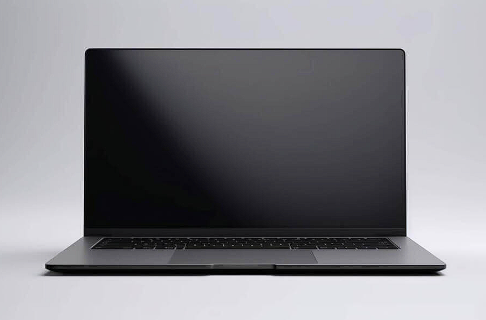
Black hardware on gray background. No plants. No coffee. No people. This is the most antisocial mockup on the list. And that is why I love it for certain clients. Some clients do not want warmth. They want authority. They want seriousness. They want a design that looks like it belongs in a boardroom, not a coffee shop. This mockup gives them that. No distractions. No softness. Just business.
Check out this Laptop Mockup now.
Black Laptop on Orange Background
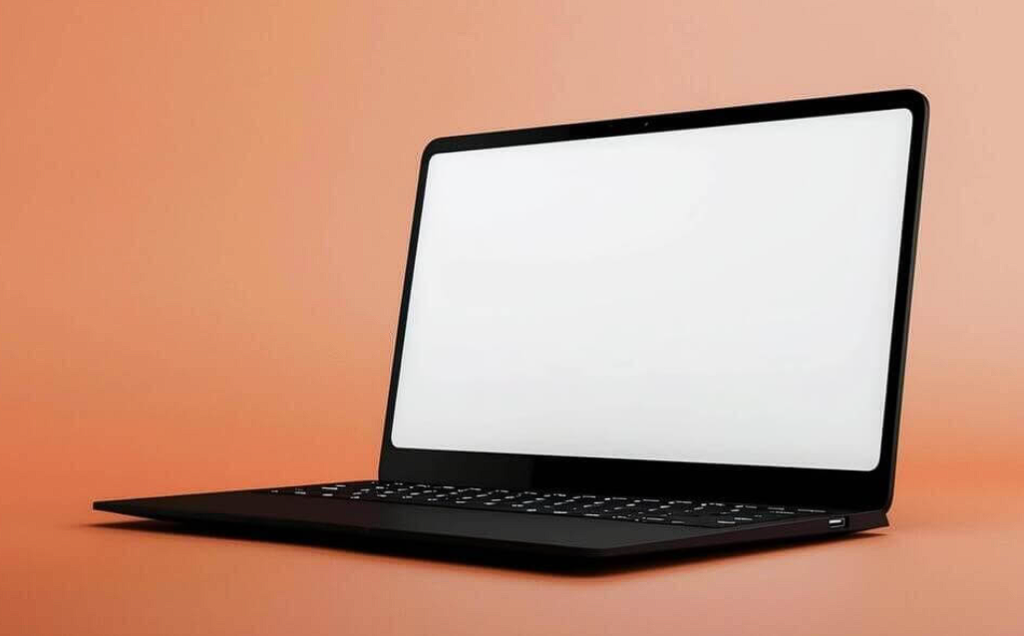
I am ending with a contradiction. Black hardware is serious. Orange background is playful. Together, they create tension. I use this mockup when I want to say “this brand is professional but not boring.” It works for creative agencies, design studios, and any brand that wants to signal both competence and personality. The tension keeps the viewer looking longer. And longer looking means more selling.
Check out this Laptop Mockup now.
Let me be blunt. Most designers treat mockups like a checkbox. Find a laptop. Drop in a screenshot. Export. Done. That is lazy. And clients can feel it. Every mockup in this collection tells a different story. A coffee cup says “I work like you work.” A plant says “I value life over efficiency.” A blurred background says “the world exists beyond this screen.” A blank screen says “your imagination belongs here.” Stop grabbing random mockups. Start choosing stories. And never let a client wonder where your design lives again.