
Poster Mockups
Here is something that used to frustrate me endlessly. I would design a poster that looked incredible on my screen. Bold typography. Perfect composition. Stunning colors. Then I would send it to a client and they would say “it looks nice, but I cannot picture it on my wall.” That sentence taught me a lesson I have never forgotten. A poster is not a file. It is a decoration. It lives on walls, above sofas, in galleries, and against textured paint. Poster Mockups are not about showing the design. They are about showing the room. The wall. The life that surrounds the poster. In this article, I will show you the scenes I use to help clients see their poster in a real space, not just on a screen.
Check out this Poster Mockup and give your design a home.
Colorful Paper Frame with Empty Space
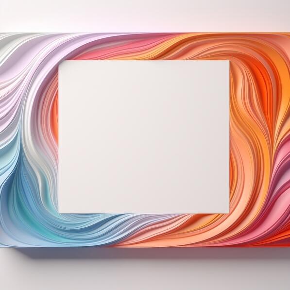
Frames change perception. This 3D printed frame made of colorful paper with an empty space in the middle is designed for displaying photos, posters, or artworks. The white background adds a photorealistic touch. I use this mockup when I need to show a poster as a finished, framed piece. The colorful frame adds personality without competing with the design inside. Here is my rule. Use framed mockups for premium presentations. Use unframed mockups for casual or conceptual work. The frame signals that the poster is ready to hang, not just ready to print.
Check out this Poster Mockup and frame your vision.
Cozy Interior Corner with Armchair and Plant
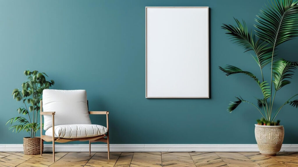
Walls are not blank. They have furniture in front of them. This cozy corner with a comfortable armchair, a leafy green plant in a woven pot, and a calming teal wall with an empty framed white canvas is a perfect example. I use this mockup when I want to show how a poster fits into a lived in space. The armchair suggests reading and relaxation. The plant suggests life and growth. The teal wall adds depth. My advice. Use interior mockups when your poster is for home decor, lifestyle brands, or any project that needs to feel warm and inviting.
Check out this Poster Mockup and bring your design home.
Serene Interior with Bench and Flowers
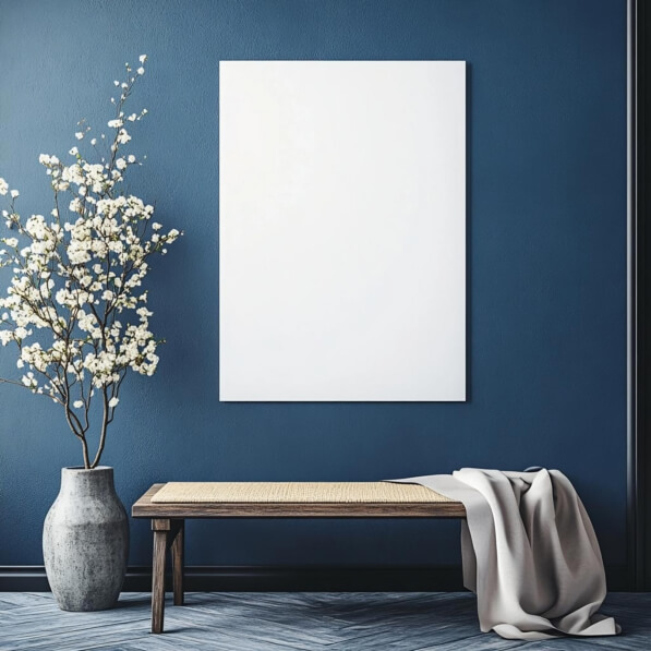
Wood and flowers create calm. This serene interior with a wooden bench, a woven top, a deep blue wall, a light gray blanket, and a vase of white flowers is tranquil and inviting. The herringbone flooring adds sophistication. I use this mockup for wellness brands, spa posters, and any project that sells peace. The blue wall signals serenity. The flowers signal freshness. The blanket signals comfort. Here is the lesson. Every element in a mockup contributes to the emotional message. Choose elements that match the feeling your poster needs to convey.
Check out this Poster Mockup and create a peaceful moment.
Blank Canvas on Vases with Pink Flowers
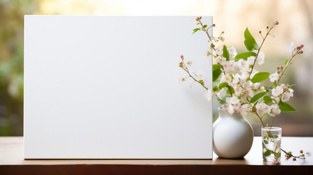
Creativity needs context. This image of a white blank canvas placed on two vases with pink flowers against a natural background of trees and grasses is serene and inspiring. I used this mockup for an art exhibition poster. The outdoor setting said “creativity lives everywhere.” The flowers added softness. The canvas said “this is art.” My advice. Use natural setting mockups for art related posters, gallery shows, and creative events. Nature signals inspiration. Inspiration sells art.
Check out this Poster Mockup and let creativity bloom.
Empty Wooden Table with White Canvas on Wall
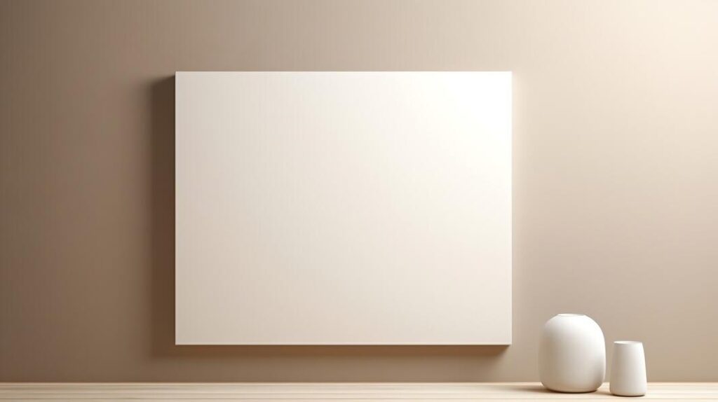
Minimalism is intentional. This interior space with a white canvas hanging on the wall next to an empty wooden table with a small vase is neutral, clean, and versatile. I use this mockup when I do not know the client’s taste yet. It is safe enough to avoid rejection but stylish enough to feel professional. The empty table invites the viewer to imagine the space complete. The small vase adds just enough warmth to avoid sterility. This is your safe choice. Reliable. Always ready.
Check out this Poster Mockup and complete the scene.
Minimalistic Interior Design with White Picture Frame, Books, and Potted Plants
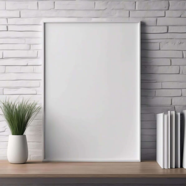
Brick walls change everything. This minimalistic interior with a white picture frame, books, and potted plants on a wooden shelf in front of a brick wall is urban, stylish, and contemporary. I use this mockup for street art posters, urban brands, and any project that needs edge. The brick wall says “city, culture, authenticity.” The books say “intellectual.” The plants say “life.” Here is the rule. Brick walls add texture and attitude. Use them when your poster needs to feel grounded and real.
Check out this Poster Mockup and add some edge.
Empty Canvases Hanging on Grey Wall
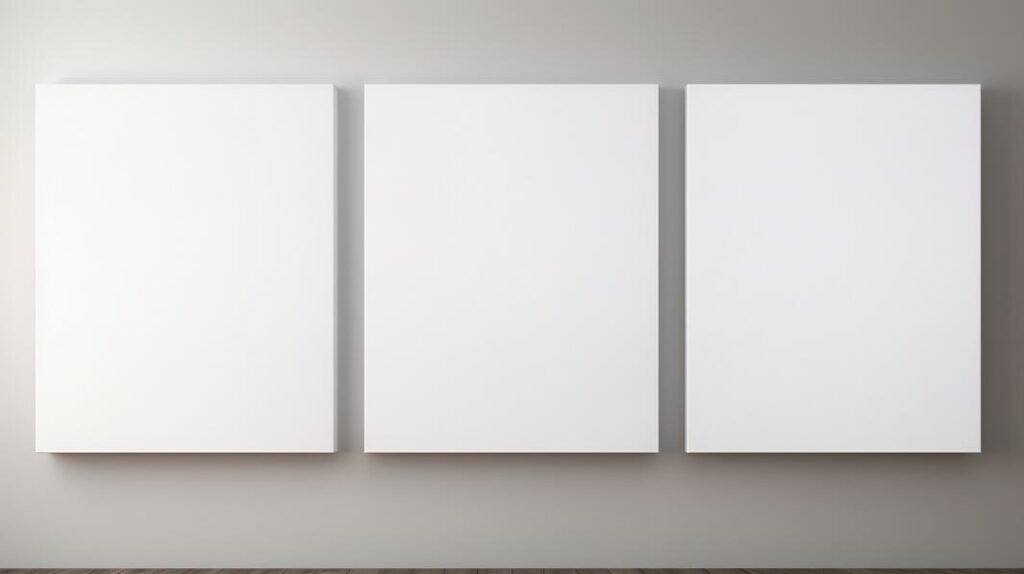
Three canvases tell a story of completion. This image of three blank canvases arranged vertically on a grey wall with an empty wooden box in the background is minimalist and gallery ready. I use this mockup when I need to present a series of posters or a collection. The vertical arrangement suggests progression. The grey wall keeps the focus clean. My advice. Use multi canvas mockups for campaign presentations, seasonal collections, or any project where the posters work together as a set. One poster is a statement. Three posters are a story.
Check out this Poster Mockup and tell a story.
Autumn Themed Table Setting with White Board, Pumpkins, and Flowers
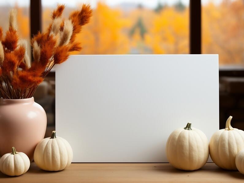
Seasonal posters need seasonal settings. This autumn themed table with a white board as the centerpiece, pumpkins, flowers, autumn leaves, and a vase with yellow flowers is festive and warm. I used this mockup for a fall festival poster and a harvest market campaign. The pumpkins said “autumn.” The yellow flowers said “sunshine.” The leaves said “change.” My advice. When your poster is seasonal, use seasonal mockups. The setting does the emotional work for you. No copy needed.
Check out this Poster Mockup and celebrate the season.
Green Square in Nature
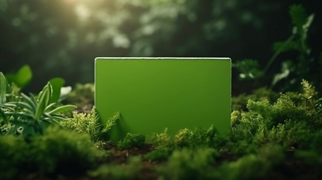
This is unusual. A green square sitting in moss and plants with sunlight shining on it. It could represent advertising, eco friendliness, or environmental sustainability. I use this mockup for environmental campaigns, sustainable brands, and outdoor events. The moss says “nature.” The sunlight says “hope.” The green square says “eco conscious.” Here is the lesson. Unusual mockups are memorable. But they only work when the message matches. A sustainable brand in nature feels right. A corporate brand in nature feels forced. Match the mockup to the message.
Check out this Poster Mockup and go green.
Minimalist Interior with Blank Canvas and Greenery
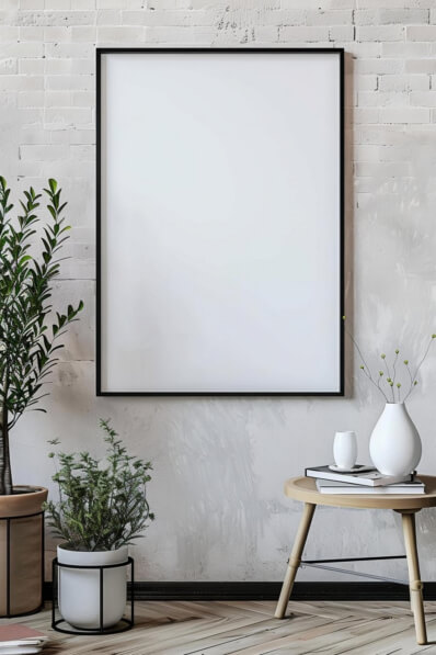
Clean and airy. This minimalist interior with a blank framed canvas on a light colored wall, decorative plants, a round table with stacked books and a small vase, is modern and inviting. I use this mockup for lifestyle brands, home decor, and any project that needs to feel contemporary. The light wall says “openness.” The plants say “freshness.” The books say “sophistication.” My advice. Use light, airy mockups for brands that value simplicity and elegance. The clean aesthetic signals quality.
Check out this Poster Mockup and keep it light.
Red Room with Empty White Board
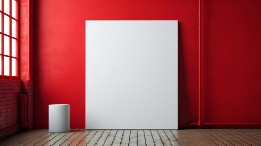
Red is a risk. This red room with an empty white board in the center, adorned with pipes along the walls, is visually interesting and bold. I use this mockup when I need to make a statement. A poster on this wall cannot be subtle. It must command attention. Here is the rule. Use bold backgrounds when your poster is bold. A minimalist poster on a red wall looks lost. A bold poster on a red wall looks powerful. Match the energy.
Check out this Poster Mockup and make a statement.
Cozy Minimalist Interior with Red Wall
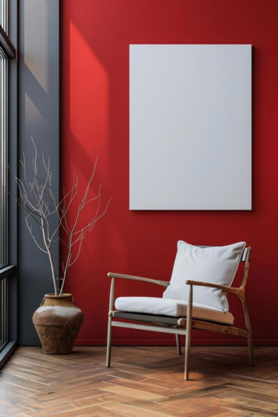
Red and white together is striking. This cozy interior with a comfortable white chair against a striking red wall, a large blank canvas above it, warm wooden flooring, and a rustic vase with dry branches is elegant and dramatic. I use this mockup for bold brands, design studios, and any project that needs to feel confident. The red wall says “passion.” The white chair says “calm.” The dry branches say “natural.” My advice. Use contrasting elements to create visual interest. The tension between red and white keeps the viewer looking longer.
Check out this Poster Mockup and find your balance.
Modern Interior with Blue Wall and Bench
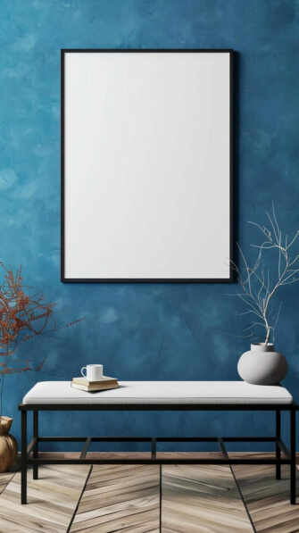
Blue is trust. This modern interior with a minimalist bench in front of a vibrant blue wall, an empty frame, a white mug, stacked books, and stylish vases with branches is contemporary and calming. The herringbone wooden floor adds sophistication. I use this mockup for corporate posters, professional brands, and any project that needs to feel reliable. The blue wall says “confidence.” The books say “knowledge.” The branches say “growth.” Here is the lesson. Blue is the most trusted color. Use it when your poster needs to build credibility.
Check out this Poster Mockup and build trust.
Elegant Pink Sofa in Modern Interior
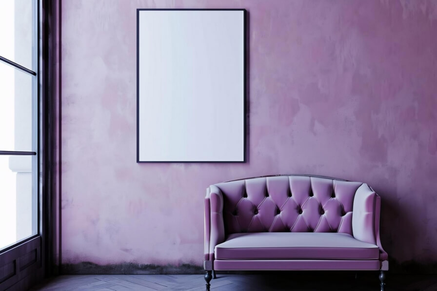
Pink is personality. This stylish pink sofa against a textured pink wall with a large blank framed canvas above it, natural light, and a modern aesthetic is soft, elegant, and sophisticated. I use this mockup for feminine brands, beauty campaigns, and lifestyle posters. The pink on pink creates a cohesive, intentional look. My advice. When using monochrome color schemes, ensure there is enough contrast between the wall and the furniture. The textured wall and the soft sofa provide that contrast. Flat on flat would look lifeless.
Check out this Poster Mockup and add some color.
Minimalist Interior Scene with Potted Plants and Frame
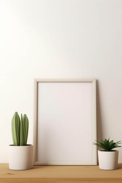
Small details matter. This minimalist interior with a blank white frame on a wooden surface, two small potted plants, and a soft beige background is calm, serene, and elegant. I use this mockup when I want the poster to feel understated and refined. The beige background says “warmth.” The plants say “life.” The frame says “art.” Here is the rule. Use soft, neutral mockups for subtle, sophisticated designs. Use bold, colorful mockups for energetic, attention grabbing designs. The mockup should never outshine the poster.
Check out this Poster Mockup and keep it elegant.
Orange Background with Hanging Paper Sheet

Orange is energy. This image with an orange background and a white sheet of paper hanging on the wall with a wooden hanger is simple but effective. I use this mockup for event posters, festival promotions, and any project that needs to feel vibrant. The orange says “excitement.” The wooden hanger says “craft.” The white sheet says “potential.” My advice. Use orange for posters that need to stand out in a crowded space. It is the color of urgency and enthusiasm.
Check out this Poster Mockup and energize your design.
Modern Interior with Blank Canvas and Green Plant
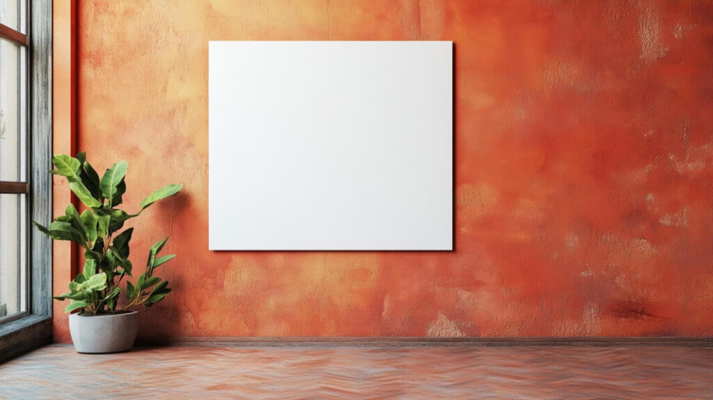
Textured walls add depth. This modern interior with a blank white canvas mounted on an orange textured wall, a vibrant green plant in a gray pot, natural light, and a wooden floor is stylish and inviting. I use this mockup when I want the poster to feel part of a designed space, not just a wall. The textured wall says “intentional.” The plant says “fresh.” The light says “real.” My advice. Use textured walls when your poster is for an interior design audience. They appreciate the detail.
Check out this Poster Mockup and add texture.
Empty Room with Blank Frame and Wooden Tables
Empty spaces invite imagination. This empty room with a blank frame, wooden tables, chairs, and potted plants is serene and open. I use this mockup when I want the client to imagine their poster in a space without distraction. The minimalism says “this room is ready for your art.” My advice. Use empty room mockups for conceptual presentations and early stage conversations. The openness invites collaboration and creativity.
Check out this Poster Mockup and imagine the possibilities.
Minimalist Interior with Blank Frame and Books
Green books add color. This minimalist interior with a blank white frame on a light wall, three stacked green books, and a small potted plant is serene and stylish. I use this mockup for book related posters, literary events, and academic projects. The green books signal “knowledge.” The plant signals “growth.” The frame signals “art.” Here is the lesson. Small props like books and plants add personality without overwhelming the scene. Use them to add subtle context.
Check out this Poster Mockup and add some context.
Blank White Poster in Empty Black Room
Black is dramatic. This image of a large blank white poster in an empty room with black walls and a smoke pipe in the corner is mysterious and striking. The contrast is extreme. I use this mockup for gallery shows, art installations, and dramatic campaigns. The black walls say “intensity.” The white poster says “purity.” The smoke pipe says “edge.” My advice. Use dark room mockups when your poster needs to feel like art, not advertising. The drama adds perceived value.
Check out this Poster Mockup and embrace the drama.
Modern Living Room with White Furniture and Wall-Mounted Poster
White furniture and a wall mounted poster. This modern living room with white walls and furniture, a wall mounted poster as the focal point, and several potted plants is clean and contemporary. I use this mockup for interior design brands, home decor, and lifestyle projects. The white furniture says “purity.” The plants say “life.” The mounted poster says “intentional.” Here is the rule. Use this mockup when your poster is designed to be the focal point of a room. It deserves that attention.
Check out this Poster Mockup and make it the focal point.
Empty Room with Five White Easels
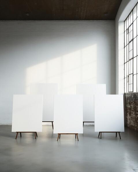
Easels are for artists. This large empty room with five white easels positioned next to each other is a gallery waiting to happen. I use this mockup for art exhibitions, gallery shows, and artist portfolios. The easels say “art.” The empty room says “potential.” The arrangement says “curated.” My advice. Use easel mockups when presenting to artists, galleries, or any audience that values the craft of presentation. Easels signal that the work is important enough to stand on its own.
Check out this Poster Mockup and exhibit your work.
Blank Billboard and Bench in Urban Setting
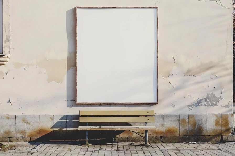
Billboards are posters at scale. This minimalistic urban setting with a large blank billboard mounted on a weathered wall, a simple bench in front, and signs of wear and peeling paint is evocative and atmospheric. I use this mockup for large scale campaigns, public art, and urban projects. The weathered wall says “history.” The empty billboard says “potential.” The bench says “pause.” My advice. Use urban mockups for brands that want to feel connected to city life and culture. The setting adds authenticity.
Check out this Poster Mockup and go big.
Square Green Light in Dark Room
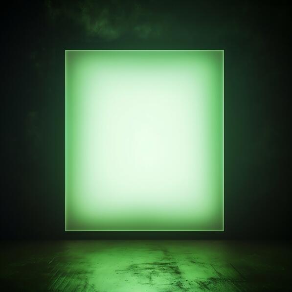
This is the most mysterious mockup on the list. A square shaped green light in an empty dark room, visible from various angles. I use this mockup for conceptual projects, art installations, and any poster that needs to feel enigmatic. The green light says “future, technology, mystery.” The dark room says “focus.” The multiple angles say “explore.” Here is the lesson. Unusual mockups are memorable. But they are also risky. Only use them when your poster can handle the attention. Otherwise, they distract.
Check out this Poster Mockup and embrace the mystery.
Here is what I have learned after years of presenting poster designs. A poster is not a design. It is a destination. It is something people walk past, glance at, and decide whether to stop. The mockup you choose determines whether that decision is yes or no. A poster on a gray wall says “look at me.” A poster in a cozy corner says “stay with me.” A poster on a brick wall says “I belong here.” A poster in a dark room says “I am art.” Every mockup in this collection answers a different question. The question is not which one is prettiest. The question is which one tells the right story for your client. So before you drop your design into a mockup, ask yourself. Where does this poster want to live? Then choose the scene that answers that question. Your client will thank you with a signature.